文本
在网页设计领域,文本是用户获取信息的主要渠道之一,其排版与样式的呈现直接影响用户的阅读体验。
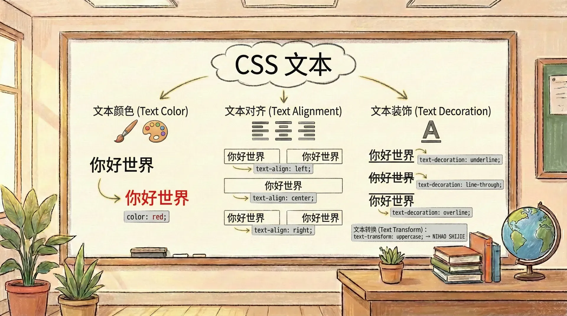
所谓文本样式,指的是围绕字体基础,对文本进行的一系列视觉调整。这些调整举例包括:控制文本在行内的对齐与分布、为特定文字加上下标、增添装饰效果(如下划线、删除线等),以及调整字母的大小写方式。
这些细致的属性设置,不仅可以突出重点信息,还能保证整体视觉统一,同时让页面呈现更具层次感和表现力。
实验室
内联方向及其对齐方式与缩进
在网页排版中,文本的排列方向通常受到所用语言书写习惯的影响。早期 CSS 的布局体系主要围绕传统的横向与纵向进行设计,但随着对多语言环境和国际化支持的加强,现代 CSS 提出了“块级方向(block direction)”和“内联方向(inline direction)”的概念。
以中文、英文为例,这类大多数自左至右、从上往下书写的语言,其“块级方向”指的是垂直的分布(即上下),而“内联方向”则是水平方向(即左右)。如果文本采用竖排(比如部分东亚语言或蒙古文本),则“块级方向”就会变成水平方向,相应的“内联方向”则顺应文字书写方式发生调整。
而对于右至左书写的语言(如阿拉伯语、希伯来语),内联方向则表现为自右到左,这些机制保证了排版在不同文化背景下都能获得正确的渲染效果。
值得一提的是,哪怕通过 CSS 旋转元素导致视觉方向发生变化,但“块级方向”和“内联方向”的相对关系并不受影响,依然保持抽象意义上的一致性。这一机制让 CSS 能够灵活应对世界各地不同语言和书写模式的页面排版需求。
段落首行缩进详解
在印刷和数字排版领域,经常会使用首行缩进以增强段落的辨识度,使读者更容易识别新段落的起始位置。CSS 中提供了 text-indent 属性来专门实现首行缩进的效果。
text-indent 可以设置为正值或负值。当为正值时,段落首行会向内缩进指定长度,常见于书籍排版中的常规段落;而设置为负值时,则产生“悬挂缩进”,即首行向外突出,后续各行对齐边缘。
<! DOCTYPE html > < html > < head > < style > .article-content p { text-indent : 2 em ; line-height : 1.6 ; margin-bottom : 1 em ; }
.article-content .hanging { text-indent : -1.5 在设置 text-indent 属性时,尤其需要留意负值缩进在实际显示中的影响。负数的缩进容易使段落首行向容器的左边界延伸,若缩进值设置过大,部分文本可能会超出可见区域或被直接裁切。为了保障文本完整地呈现,通常建议同时配合 margin 或 padding 等属性,在元素左侧留出充足的空间,避免内容被遮挡。
另外,当 text-indent 使用百分比作为缩进单位时,这里的百分比实际上是依据父级元素的宽度来计算的。因此,采用百分比缩进可以提升布局的自适应能力,非常适合响应式网页设计,让内容在不同屏幕尺寸下都能保持合适的缩进效果。
使用负值缩进时,务必为相关元素设置足够的左侧边距(或内边距),以免文字内容因溢出而不可见。
文本对齐方式
在文档排版过程中,文本对齐通常是比缩进更基础的排版需求。CSS 提供了多样化的文本对齐方式,帮助我们细致地控制文本在块级元素中的布局样式。
text-align 属性就是专门用来规定块级元素中文本内容的水平排列方式的。它包含多种取值,能够实现左对齐、居中、右对齐以及两端对齐,不同情况可根据实际需求灵活选择,以营造所需的视觉和阅读效果。
<! DOCTYPE html > < html > < head > < style > .text-examples { width : 100 % ; max-width : 600 px ; margin : 20 px auto ; border : 1 px solid #ddd ; padding 需要注意,text-align 属性只是用来设置块级元素内部文本内容的排列方式,比如让文字居左、居中或居右。它并不会影响这个块级元素本身在页面中的实际位置。如果想让整个元素在页面里水平居中,还需要借助如 margin 或布局等其他 CSS 技巧实现。
此外,text-align 的默认值通常是 start。对于从左到右书写的语言(如中文、英文),start 表示左对齐;而对于从右到左的语言,则会自动变为右对齐。这样,浏览器可以针对不同的语言环境自动进行合理的文本对齐,提升了多语言界面的适配性和可读性。
在处理诸如“左右两端对齐”这种段落排版时,最后一行内容经常会由于长度不足而显得排版与上面各行不同。此时,可以使用 CSS 的 text-align-last 属性,专门指定文本块末行的对齐方式,让整段文本的视觉效果更加统一和精准。
<! DOCTYPE html > < html > < head > < style > .justified-text { text-align : justify ; text-align-last : center ; width : 300 px ; border : 1 px solid #ccc ; padding : 15 text-align-last 属性常常应用于对排版要求较高的场景,例如书籍、杂志以及商务文书等。针对这些类型的文档,我们往往需要对段落最后一行进行特殊的对齐处理,以确保整体页面风格的一致和排版的专业感。
控制文本间距
优化文本视觉效果时,合理设置字符和单词之间的距离十分关键。通过 CSS 提供的一系列属性,我们能够灵活地调整词间距与字间距,在保证内容易读性的同时进一步提升页面美观度和排版质量。
调整单词间距
word-spacing 属性可以用来修改默认状态下单词之间的间隔。指定正值时,单词之间的距离会被拉大,看起来更宽松;而设置负值则会让单词间更紧密,适用于空间有限或需要提升信息密度的场合。
<! DOCTYPE html > < html > < head > < style > .spacing-examples { max-width : 800 px ; margin : 20 px auto ; padding : 20 px ; border : 1 px solid #ddd ; } 使用 word-spacing 属性时,需要特别注意它在中文文本中的实际效果。由于中文不像英文那样以单词为单位进行分隔,汉字之间本身的间隔设计就是最合适的,因此调整 word-spacing 通常不会带来预期的视觉变化,甚至可能影响阅读体验。只有在特殊场景下,例如需要实现某些特殊排版效果时,才建议谨慎使用该属性。
细致调整字间距
与用于调整单词间距的 word-spacing 不同,letter-spacing 属性专注于微调每个字符之间的距离。合理设置 letter-spacing,可以有效地改变文本整体的紧凑程度与视觉美感,对提升排版的清晰度和可读性具有重要作用。通过调整字间距,可以根据不同设计需求让文本更易于辨识或更具风格化。
<! DOCTYPE html > < html > < head > < style > .letter-spacing-examples { max-width : 800 px ; margin : 20 px auto ; padding : 20 px ; border : 1 px solid #ddd ; } 在调整字间距时,推荐使用类似 em 这样的相对单位,这样设置字母之间的距离会随着字体尺寸的变化而自适应,能够更好地保证整体排版的协调性。针对英文文本,适当的调节字间距有助于提升阅读体验,使内容更清晰易读。需要注意的是,如果字间距设置得过大或过小,反而会让阅读变得困难,影响可读性。
请注意,字间距(letter-spacing)和词间距(word-spacing)属性默认会被子元素继承。如果不同字号的文本需要不同的间距值,建议为各自的元素分别单独指定这些属性,从而达到更理想的效果。
文本在垂直方向的控制
在网页排版过程中,除了横向的字面分布,精确把控文本的纵向空间同样至关重要。合理安排文本在垂直方向的排布,包括设置合适的行高和解决行内元素的垂直对齐,能有效提高页面的视觉层次和阅读的舒适度。
行高的调整与作用
line-height 属性用于指定文本基线之间的垂直间隔,也就是规定了每一行文本上下的空间。它不仅影响整体文本的密集程度,还直接决定了段落的阅读流畅性和视觉美观性。通过优化 line-height,可以让文本看起来更疏朗或更加紧凑,根据需求灵活调整排版效果。
<! DOCTYPE html > < html > < head > < style > .line-height-examples { max-width : 900 px ; margin : 20 px auto ; padding : 20 px ; border : 1 px solid #ddd ; } 在设置 line-height 属性时,首先需要弄清楚它对页面中内容排布的实际作用。line-height 决定了每一行所占据的高度空间,而行内的文字或其它元素会在这个空间内垂直居中显示,从而影响文本块的整体视觉效果和可读性。
行内元素如何垂直对齐
当一行中同时包含了文字、图片或其它行内元素时,vertical-align 属性显得尤为重要。它主要用来调整这些行内元素相对于基线(baseline)的垂直位置,使元素能够按照设计预期对齐到合适的高度。
<! DOCTYPE html > < html > < head > < style > .vertical-align-demo { font-size : 16 px ; line-height : 2 ; padding : 20 px ; border : 1 px solid #ddd ; margin : vertical-align 属性能够灵活地调整行内元素在父元素中的垂直位置,允许开发者根据实际需求选择多种对齐方式。这在排版涉及图标、特殊符号或数学公式等元素时尤为有用,可以确保内容排列更加美观规范。
需要注意的是,vertical-align 只对行内元素(inline 或 inline-block)以及表格单元格(table-cell)起作用,对于块级元素则无任何效果。
文本大小写转换
网页开发过程中,经常会面临改变文本大小写样式的需求。通过 text-transform 属性,我们可以轻松、更高效地实现不同的字母大小写形式,而无需直接更改 HTML 标签内的文本内容,极大地方便了样式的统一与管理。
<! DOCTYPE html > < html > < head > < style > .transform-examples { max-width : 900 px ; margin : 20 px auto ; padding : 20 px ; border : 1 px solid #ddd ; font-family text-transform 属性常用于标题及网站导航等模块,通过在样式表中统一配置字母大小写的显示方式,可以有效保证网页整体的视觉风格一致性,同时不会影响到HTML内容本身的语义结构。
值得注意的是,在采用 capitalize 参数时,应当留意浏览器对“单词”边界的判断依据。比如英文中的连字符单词,capitalize 只作用于每个独立词段的首字母,实际效果有时可能和预期有出入。
需要强调的是,text-transform 仅负责前端展示文本的样式,它不会更改HTML中的实际字符内容。对于辅助功能设备(如屏幕阅读器)等,文本依然按照原有字符大小写进行处理和朗读。
文本装饰
在网站制作过程中,经常会用到文本装饰,来加强页面的信息分层或实现互动提示等效果。CSS 提供了多种文本修饰属性,能实现下划线、上划线、删除线等不同的视觉表现。
控制装饰线的位置
通过 text-decoration-line 属性,我们可以灵活地为文本添加下划线(underline)、上划线(overline)、删除线(line-through),从而实现需求不同的文本修饰效果。
<! DOCTYPE html > < html > < head > < style > .decoration-examples { max-width : 900 px ; margin : 20 px auto ; padding : 20 px ; border : 1 px solid #ddd ; font-family 装饰线的颜色设置
text-decoration-color 属性允许我们单独指定文本装饰线(如下划线、上划线或删除线)的颜色,使其可以和文字本身的颜色区分开来。这样不仅增强了视觉表现力,还能为界面设计带来更多灵活性和层次感。
<! DOCTYPE html > < html > < head > < style > .color-decoration-examples { max-width : 900 px ; margin : 20 px auto ; padding : 20 px ; border : 1 px solid #ddd ; font-family 装饰线的粗细控制
通过设置 text-decoration-thickness 属性,我们可以灵活地控制装饰线的宽度,无论是需要极细的线条,还是想要更具存在感的粗线都可以实现。
<! DOCTYPE html > < html > < head > < style > .thickness-examples { max-width : 900 px ; margin : 20 px auto ; padding : 20 px ; border : 1 px solid #ddd ; font-family 装饰线的样式变化
text-decoration-style 属性允许我们自定义下划线等装饰线的显示方式。你可以通过设置这个属性,使装饰线不再局限于普通实线,还能呈现如虚线、点线或波浪线等多种视觉风格,极大丰富了文本的表达效果。
<! DOCTYPE html > < html > < head > < style > .style-examples { max-width : 900 px ; margin : 20 px auto ; padding : 20 px ; border : 1 px solid #ddd ; font-family 下划线位置调整
text-underline-offset 属性用于设定下划线距离文本基线的具体间距。通过这个属性,可以灵活控制下划线和文字之间的高度分隔,使下划线呈现出更加理想的视觉效果,非常适用于需要精细排版的场景。
<! DOCTYPE html > < html > < head > < style > .offset-examples { max-width : 900 px ; margin : 20 px auto ; padding : 20 px ; border : 1 px solid #ddd ; font-family text-decoration 属性可以作为简写属性,将线条位置、颜色、样式和粗细等属性合并设置,提供更便捷的声明方式。
文本阴影效果
在网页设计中,阴影效果能够为文本增添立体感和深度。text-shadow 属性允许我们在文本后面添加阴影,创造出浮雕般的视觉效果。
<! DOCTYPE html > < html > < head > < style > .shadow-examples { max-width : 900 px ; margin : 20 px auto ; padding : 20 px ; border : 1 px solid #ddd ; font-family text-shadow 属性支持为同一文本设置多个阴影,只需使用逗号将各组阴影参数隔开即可。这一特性可以让我们灵活实现丰富的视觉层次,比如基础的阴影立体感,或结合多重色彩与不同模糊半径营造出发光、发亮等更为复杂的效果。
过量添加阴影层或设置过大的模糊值有可能导致网页渲染效率下降,尤其是在移动端设备上更要谨慎,注意性能优化。
文本强调标记
在中文、日文等东亚文字体系中,常常需要在字词的顶部或底部加上点、圈、线等标记,用于突出或标明读音。CSS 提供了 text-emphasis 相关属性,让开发者无需额外插入标签或图片,即可直接用样式实现这种强调效果。
强调标记样式的个性化
借助 text-emphasis-style 属性,我们可以自如选择所需的点、圈、三角等标记形态,甚至可以用自定义字符,满足不同语言环境和排版需求。
<! DOCTYPE html > < html > < head > < style > .emphasis-examples { max-width : 900 px ; margin : 20 px auto ; padding : 20 px ; border : 1 px solid #ddd ; font-family 强调标记的颜色控制
通过 text-emphasis-color 属性,我们可以为强调标记设置与文本不同的颜色。
<! DOCTYPE html > < html > < head > < style > .color-emphasis-examples { max-width : 900 px ; margin : 20 px auto ; padding : 20 px ; border : 1 px solid #ddd ; font-family 控制强调标记的位置
通过设置 text-emphasis-position 属性,我们可以精确指定文本强调标记(如点、圆圈等)出现在文字的上方还是下方,或是在左侧还是右侧,这一功能在垂直排版时尤为重要,有助于提升阅读体验和排版的灵活性。
需要注意的是,强调标记会参与文本的行高计算。为了显示这些标记,浏览器会自动为其在排版时预留空间。
空白字符的管理
在前端开发过程中,经常需要针对文本中的空格、换行符和制表符等空白字符做出灵活调整。white-space 属性提供了细致的控制方式,允许开发者定义这些空白符在页面呈现时的具体行为。
空白处理模式
white-space 属性主要用于决定元素内部空白字符(如连续空格、制表符以及换行符)的展示与折行规则,帮助开发者实现所需的文本布局效果。
<! DOCTYPE html > < html > < head > < style > .whitespace-examples { max-width : 900 px ; margin : 20 px auto ; padding : 20 px ; border : 1 px solid #ddd ; font-family 制表符宽度设置
在文本中如果包含制表符(Tab,通常在代码或表格中看到),它的默认宽度可能会很大或不太美观。tab-size 属性就是用来设置每个制表符到底要占多少个空格宽度的。比如设为 4,就是每个 Tab 看起来和 4 个空格一样宽,这样可以让内容的对齐和排版更符合我们的需求,让代码或数据表看起来更整齐、更好读。
<! DOCTYPE html > < html > < head > < style > .tab-examples { max-width : 900 px ; margin : 20 px auto ; padding : 20 px ; border : 1 px solid #ddd ; font-family 需要注意的是,只有在 white-space 属性设置为允许保留空白字符时,tab-size 才会实际影响文本的显示效果。
小结
CSS 的文本属性不仅决定了文字的排列、缩进、装饰和空白处理等多个方面,也是网页排版美观与可读性的关键。合理使用这些属性,能让页面内容在不同场景和多语言环境下都更易读、布局更规范,也能突出不同的文本重点。
在实际开发时,我们要结合设计需求和用户习惯灵活搭配这些文本相关的 CSS 属性,这不仅有助于提升页面表现力,更能让信息传递更清晰。
实战练习
练习1:文本对齐
请写出让段落文本居中对齐的CSS属性和值。
练习2:首行缩进
如何设置段落首行缩进2个字符?
练习3:行高设置
如何设置文本行高为字体大小的1.5倍?
练习4:文本装饰
如何为链接添加下划线?
text-decoration-line: underline;
练习5:字间距调整
如何增加字母之间的间距?
练习6:大小写转换
如何将所有英文文本转换为大写?
text-transform: uppercase;
练习7:文本阴影
如何为文本添加简单的阴影效果?
text-shadow: 2px 2px 4px rgba(0, 0, 0, 0.3);
练习8:垂直对齐
如何让行内图片与文字基线对齐?
vertical-align: baseline;
练习9:空白字符处理
如何让文本中的多个连续空格合并为一个?
练习10:制表符宽度
如何设置制表符的宽度为4个字符?
练习11:文本强调标记
如何在中文文本上方添加点标记?
text-emphasis-style: dot;
练习12:装饰线样式
如何设置虚线下划线?
text-decoration-style: dashed;
练习13:悬挂缩进
如何实现悬挂缩进效果?
text-indent: -1.5em; margin-left: 1.5em;
练习14:两端对齐
如何让段落文本两端对齐?
练习15:装饰线粗细
如何设置下划线的粗细为3像素?
text-decoration-thickness: 3px;
em
;
margin-left : 1.5 em ;
}
</ style >
</ head >
< body >
< div class = "article-content" >
< p >这是一个标准的段落缩进示例。在传统的书籍排版中,第一行通常会向内缩进一定距离,这样有助于读者区分段落的开始。这种缩进方式在中文排版中也非常常见,能够提高文本的可读性。</ p >
< p class = "hanging" >悬挂缩进是一种特殊的排版技巧,常用于术语列表或引用文字的排版。在这种样式中,第一行会向左延伸,而其余行保持正常对齐。这种方式能够突出显示重要的术语或概念。</ p >
</ div >
</ body >
</ html >
:
20
px
;
}
.left-align {
text-align : left ;
background-color : #f0f8ff ;
padding : 10 px ;
margin-bottom : 15 px ;
}
.center-align {
text-align : center ;
background-color : #fffacd ;
padding : 10 px ;
margin-bottom : 15 px ;
}
.right-align {
text-align : right ;
background-color : #f0fff0 ;
padding : 10 px ;
margin-bottom : 15 px ;
}
.justify-align {
text-align : justify ;
background-color : #ffe4e1 ;
padding : 10 px ;
margin-bottom : 15 px ;
}
</ style >
</ head >
< body >
< div class = "text-examples" >
< p class = "left-align" >左对齐文本是网页中最常见的排列方式。文字沿着容器的左侧边缘对齐,右侧边缘保持自然。这种方式符合大多数人的阅读习惯,容易形成整齐的视觉边界。</ p >
< p class = "center-align" >居中对齐通常用于标题、标语或特殊的强调性文字。这种排列方式能够创造出庄重、正式的视觉效果,适合用于页面标题或重要声明。</ p >
< p class = "right-align" >右对齐文本常用于创建特殊的视觉效果,比如在表格中对齐数字列,或是在设计中使用不对称的排版布局。右对齐能够形成与左对齐完全不同的视觉张力。</ p >
< p class = "justify-align" >两端对齐是印刷出版物的经典选择。通过调整单词和字母之间的间距,使每一行的文本都完全填充容器的宽度。这种方式能够创造出报纸或书籍般的专业外观,但也可能影响阅读流畅性。</ p >
</ div >
</ body >
</ html >
px
;
line-height : 1.5 ;
font-size : 14 px ;
}
.justified-text p {
margin : 0 ;
}
</ style >
</ head >
< body >
< div class = "justified-text" >
< p >在设计新闻稿或正式文档时,我们常常需要处理段落末尾的对齐问题。两端对齐能够创造出专业的印刷效果,但最后一行往往显得不够整齐。通过专门控制末行对齐,我们能够在保持整体美观的同时,确保最后一行也有恰当的视觉处理。</ p >
</ div >
</ body >
</ html >
.normal-spacing {
word-spacing : normal ;
background-color : #f9f9f9 ;
padding : 10 px ;
margin-bottom : 15 px ;
}
.wide-spacing {
word-spacing : 0.5 em ;
background-color : #e6f7ff ;
padding : 10 px ;
margin-bottom : 15 px ;
}
.tight-spacing {
word-spacing : -0.2 em ;
background-color : #fff7e6 ;
padding : 10 px ;
margin-bottom : 15 px ;
}
</ style >
</ head >
< body >
< div class = "spacing-examples" >
< p class = "normal-spacing" >这是标准词间距的文本示例。在正常情况下,单词之间的间距是由字体和浏览器默认设置决定的。这种间距通常能够提供良好的可读性。</ p >
< p class = "wide-spacing" >宽松词间距能够创造出更加舒展的视觉效果。这种样式常常用于需要强调正式感或艺术感的场合,比如诗歌排版或重要声明。</ p >
< p class = "tight-spacing" >紧凑词间距可以让文本显得更加凝练和紧凑。这种样式适合用于空间有限的设计场景,或者需要突出文字密度的地方。</ p >
</ div >
</ body >
</ html >
.default-letters {
letter-spacing : normal ;
background-color : #f0f9ff ;
padding : 15 px ;
margin-bottom : 15 px ;
font-family : 'Arial' , sans-serif ;
}
.spacious-letters {
letter-spacing : 0.1 em ;
background-color : #f6ffed ;
padding : 15 px ;
margin-bottom : 15 px ;
font-family : 'Arial' , sans-serif ;
}
.compact-letters {
letter-spacing : -0.05 em ;
background-color : #fff2e8 ;
padding : 15 px ;
margin-bottom : 15 px ;
font-family : 'Arial' , sans-serif ;
}
</ style >
</ head >
< body >
< div class = "letter-spacing-examples" >
< p class = "default-letters" >这是默认字间距的英文示例文本。字符之间的间距保持了字体的自然设计。</ p >
< p class = "spacious-letters" >这是放宽字间距的英文示例文本。每个字符之间有了更多的呼吸空间。</ p >
< p class = "compact-letters" >这是紧凑字间距的英文示例文本。字符被拉得更近,营造出不同的视觉效果。</ p >
</ div >
</ body >
</ html >
.normal-line {
line-height : normal ;
background-color : #f5f5f5 ;
padding : 15 px ;
margin-bottom : 20 px ;
}
.loose-line {
line-height : 2 ;
background-color : #e6f7ff ;
padding : 15 px ;
margin-bottom : 20 px ;
}
.tight-line {
line-height : 1.2 ;
background-color : #f6ffed ;
padding : 15 px ;
margin-bottom : 20 px ;
}
.fixed-line {
line-height : 24 px ;
background-color : #fff7e6 ;
padding : 15 px ;
margin-bottom : 20 px ;
}
</ style >
</ head >
< body >
< div class = "line-height-examples" >
< p class = "normal-line" >这是默认行高的段落文本。浏览器会根据字体大小自动计算合适的行高,通常在1.2到1.4倍之间。这种设置能够提供良好的可读性,适合大多数阅读场景。</ p >
< p class = "loose-line" >这是宽松行高的段落示例。通过增加行高,我们为每行文本提供了更多的垂直空间。这种设置特别适合需要舒适阅读体验的场合,比如电子书或博客文章。</ p >
< p class = "tight-line" >这是紧凑行高的段落文本。较小的行高让文本显得更加紧凑,适合需要在有限空间内显示更多内容的场景。这种设置在移动端设计中特别有用。</ p >
< p class = "fixed-line" >这是固定像素行高的段落。无论字体大小如何变化,行高都保持在24像素。这种方法在需要精确控制布局时很有用,但可能不适合响应式设计。</ p >
</ div >
</ body >
</ html >
20
px
auto
;
max-width : 800 px ;
}
.baseline img {
vertical-align : baseline ;
}
.super-text {
vertical-align : super ;
font-size : 12 px ;
color : #1890ff ;
}
.sub-text {
vertical-align : sub ;
font-size : 12 px ;
color : #52c41a ;
}
.top-align img {
vertical-align : top ;
}
.middle-align img {
vertical-align : middle ;
}
.bottom-align img {
vertical-align : bottom ;
}
.pixel-adjust {
vertical-align : -5 px ;
background-color : #fff2e8 ;
}
</ style >
</ head >
< body >
< div class = "vertical-align-demo" >
< p >基线对齐:< img src = "data:image/svg+xml;base64,PHN2ZyB3aWR0aD0iMjAiIGhlaWdodD0iMjAiIHZpZXdCb3g9IjAgMCAyMCAyMCIgeG1sbnM9Imh0dHA6Ly93d3cudzMub3JnLzIwMDAvc3ZnIj48cmVjdCB3aWR0aD0iMjAiIGhlaWdodD0iMjAiIGZpbGw9IiMxODkwZmYiLz48L3N2Zz4=" alt = "蓝色方块" class = "baseline" /> 图片的底部与文本基线对齐。</ p >
< p >上标和下标:E = mc< span class = "super-text" >2</ span > 和 H< span class = "sub-text" >2</ span >O 是著名的科学公式。</ p >
< p >顶部对齐:< img src = "data:image/svg+xml;base64,PHN2ZyB3aWR0aD0iMjAiIGhlaWdodD0iMjAiIHZpZXdCb3g9IjAgMCAyMCAyMCIgeG1sbnM9Imh0dHA6Ly93d3cudzMub3JnLzIwMDAvc3ZnIj48Y2lyY2xlIGN4PSIxMCIgY3k9IjEwIiByPSI4IiBmaWxsPSIjNTJjNDFhIi8+PC9zdmc+" alt = "绿色圆圈" class = "top-align" /> 圆圈的顶部与行框顶部对齐。</ p >
< p >居中对齐:< img src = "data:image/svg+xml;base64,PHN2ZyB3aWR0aD0iMjAiIGhlaWdodD0iMjAiIHZpZXdCb3g9IjAgMCAyMCAyMCIgeG1sbnM9Imh0dHA6Ly93d3cudzMub3JnLzIwMDAvc3ZnIj48dHJpYW5nbGUgcG9pbnRzPSIxMCAyMCAxMCAyMCAyMCAyMCIgZmlsbD0iI2ZhYWQ0ZSIvPjwvc3ZnPg==" alt = "橙色三角" class = "middle-align" /> 三角形的垂直中心点与文本的x高度中点对齐。</ p >
< p >底部对齐:< img src = "data:image/svg+xml;base64,PHN2ZyB3aWR0aD0iMjAiIGhlaWdodD0iMjAiIHZpZXdCb3g9IjAgMCAyMCAyMCIgeG1sbnM9Imh0dHA6Ly93d3cudzMub3JnLzIwMDAvc3ZnIj48cmVjdCB4PSIyIiB5PSIyIiB3aWR0aD0iMTYiIGhlaWdodD0iMTYiIGZpbGw9IiNmYWFkNGUiLz48L3N2Zz4=" alt = "橙色方块" class = "bottom-align" /> 方块的底部与行框底部对齐。</ p >
< p >像素级调整:< span class = "pixel-adjust" >这段文本</ span > 通过负像素值向下偏移了5像素。</ p >
</ div >
</ body >
</ html >
:
'Arial'
,
sans-serif
;
}
.none-transform {
text-transform : none ;
background-color : #f5f5f5 ;
padding : 15 px ;
margin-bottom : 15 px ;
}
.uppercase-transform {
text-transform : uppercase ;
background-color : #e6f7ff ;
padding : 15 px ;
margin-bottom : 15 px ;
}
.lowercase-transform {
text-transform : lowercase ;
background-color : #f6ffed ;
padding : 15 px ;
margin-bottom : 15 px ;
}
.capitalize-transform {
text-transform : capitalize ;
background-color : #fff7e6 ;
padding : 15 px ;
margin-bottom : 15 px ;
}
.heading-example {
text-transform : uppercase ;
font-size : 18 px ;
font-weight : bold ;
color : #1890ff ;
margin-bottom : 20 px ;
}
</ style >
</ head >
< body >
< div class = "transform-examples" >
< h3 class = "heading-example" >website navigation</ h3 >
< p class = "none-transform" >This is the default text transformation. All letters maintain their original capitalization as written in the HTML source.</ p >
< p class = "uppercase-transform" >this paragraph demonstrates uppercase transformation. every letter becomes capitalized.</ p >
< p class = "lowercase-transform" >THIS PARAGRAPH DEMONSTRATES LOWERCASE TRANSFORMATION. EVERY LETTER BECOMES LOWERCASE.</ p >
< p class = "capitalize-transform" >this paragraph demonstrates capitalize transformation. only the first letter of each word becomes capitalized.</ p >
</ div >
</ body >
</ html >
:
'Arial'
,
sans-serif
;
font-size : 16 px ;
}
.underline-example {
text-decoration-line : underline ;
background-color : #e6f7ff ;
padding : 15 px ;
margin-bottom : 15 px ;
}
.overline-example {
text-decoration-line : overline ;
background-color : #f6ffed ;
padding : 15 px ;
margin-bottom : 15 px ;
}
.line-through-example {
text-decoration-line : line-through ;
background-color : #fff2e8 ;
padding : 15 px ;
margin-bottom : 15 px ;
}
.multiple-decoration {
text-decoration-line : underline overline ;
background-color : #f9f9f9 ;
padding : 15 px ;
margin-bottom : 15 px ;
}
.link-style {
text-decoration-line : underline ;
color : #1890ff ;
cursor : pointer ;
}
.link-style:hover {
text-decoration-line : underline overline ;
color : #40a9ff ;
}
</ style >
</ head >
< body >
< div class = "decoration-examples" >
< p class = "underline-example" >这是带有下划线的文本。下划线常用于表示链接或强调重要内容。</ p >
< p class = "overline-example" >这是带有上划线的文本。上划线可以创造独特的视觉效果。</ p >
< p class = "line-through-example" >这是带有删除线的文本。删除线通常表示已删除或过时的内容。</ p >
< p class = "multiple-decoration" >这个文本同时具有上划线和下划线,创造出特殊的视觉强调效果。</ p >
< p >请< span class = "link-style" >点击这里</ span >查看交互效果,鼠标悬停时会出现额外的装饰线。</ p >
</ div >
</ body >
</ html >
:
'Arial'
,
sans-serif
;
font-size : 16 px ;
}
.red-underline {
text-decoration-line : underline ;
text-decoration-color : #ff4d4f ;
color : #262626 ;
background-color : #fff2e8 ;
padding : 15 px ;
margin-bottom : 15 px ;
}
.blue-overline {
text-decoration-line : overline ;
text-decoration-color : #1890ff ;
color : #262626 ;
background-color : #e6f7ff ;
padding : 15 px ;
margin-bottom : 15 px ;
}
.green-strike {
text-decoration-line : line-through ;
text-decoration-color : #52c41a ;
color : #8c8c8c ;
background-color : #f6ffed ;
padding : 15 px ;
margin-bottom : 15 px ;
}
.gradient-text {
background : linear-gradient ( 45 deg , #1890ff , #52c41a );
-webkit-background-clip : text ;
-webkit-text-fill-color : transparent ;
background-clip : text ;
text-decoration-line : underline ;
text-decoration-color : #faad14 ;
padding : 15 px ;
margin-bottom : 15 px ;
}
</ style >
</ head >
< body >
< div class = "color-decoration-examples" >
< p class = "red-underline" >这段文本使用红色下划线来突出显示重要信息。</ p >
< p class = "blue-overline" >这段文本使用蓝色上划线来创造视觉层次。</ p >
< p class = "green-strike" >这段文本使用绿色删除线表示已完成的任务。</ p >
< p class = "gradient-text" >这段渐变色文本搭配橙色下划线,创造出现代化的视觉效果。</ p >
</ div >
</ body >
</ html >
:
'Arial'
,
sans-serif
;
font-size : 16 px ;
}
.thin-line {
text-decoration-line : underline ;
text-decoration-thickness : 1 px ;
background-color : #f9f9f9 ;
padding : 15 px ;
margin-bottom : 15 px ;
}
.medium-line {
text-decoration-line : underline ;
text-decoration-thickness : 3 px ;
background-color : #e6f7ff ;
padding : 15 px ;
margin-bottom : 15 px ;
}
.thick-line {
text-decoration-line : underline ;
text-decoration-thickness : 5 px ;
background-color : #f6ffed ;
padding : 15 px ;
margin-bottom : 15 px ;
}
.em-line {
text-decoration-line : underline ;
text-decoration-thickness : 0.2 em ;
background-color : #fff7e6 ;
padding : 15 px ;
margin-bottom : 15 px ;
}
.percentage-line {
text-decoration-line : underline ;
text-decoration-thickness : 15 % ;
background-color : #fff2e8 ;
padding : 15 px ;
margin-bottom : 15 px ;
}
</ style >
</ head >
< body >
< div class = "thickness-examples" >
< p class = "thin-line" >这是1像素粗细的下划线,显得非常细致精巧。</ p >
< p class = "medium-line" >这是3像素粗细的下划线,提供了适中的视觉强调。</ p >
< p class = "thick-line" >这是5像素粗细的下划线,显得粗壮而醒目。</ p >
< p class = "em-line" >这是基于字体大小的0.2em粗细下划线,会随字体大小自动调整。</ p >
< p class = "percentage-line" >这是15%字体大小的下划线粗细,创造出独特的视觉比例。</ p >
</ div >
</ body >
</ html >
:
'Arial'
,
sans-serif
;
font-size : 16 px ;
}
.solid-style {
text-decoration-line : underline ;
text-decoration-style : solid ;
text-decoration-thickness : 2 px ;
background-color : #f9f9f9 ;
padding : 15 px ;
margin-bottom : 15 px ;
}
.double-style {
text-decoration-line : underline ;
text-decoration-style : double ;
text-decoration-thickness : 3 px ;
background-color : #e6f7ff ;
padding : 15 px ;
margin-bottom : 15 px ;
}
.dotted-style {
text-decoration-line : underline ;
text-decoration-style : dotted ;
text-decoration-thickness : 2 px ;
background-color : #f6ffed ;
padding : 15 px ;
margin-bottom : 15 px ;
}
.dashed-style {
text-decoration-line : underline ;
text-decoration-style : dashed ;
text-decoration-thickness : 2 px ;
background-color : #fff7e6 ;
padding : 15 px ;
margin-bottom : 15 px ;
}
.wavy-style {
text-decoration-line : underline ;
text-decoration-style : wavy ;
text-decoration-thickness : 2 px ;
text-decoration-color : #1890ff ;
background-color : #fff2e8 ;
padding : 15 px ;
margin-bottom : 15 px ;
}
</ style >
</ head >
< body >
< div class = "style-examples" >
< p class = "solid-style" >这是实线样式的下划线,简单而经典。</ p >
< p class = "double-style" >这是双线样式的下划线,显得更加正式和醒目。</ p >
< p class = "dotted-style" >这是点线样式的下划线,创造出轻快的视觉效果。</ p >
< p class = "dashed-style" >这是虚线样式的下划线,常用于表示草稿或临时状态。</ p >
< p class = "wavy-style" >这是波浪线样式的下划线,通常用于表示拼写错误或需要注意的地方。</ p >
</ div >
</ body >
</ html >
:
'Arial'
,
sans-serif
;
font-size : 16 px ;
line-height : 2 ;
}
.default-offset {
text-decoration-line : underline ;
text-decoration-thickness : 2 px ;
background-color : #f9f9f9 ;
padding : 15 px ;
margin-bottom : 15 px ;
}
.positive-offset {
text-decoration-line : underline ;
text-decoration-thickness : 2 px ;
text-underline-offset : 4 px ;
background-color : #e6f7ff ;
padding : 15 px ;
margin-bottom : 15 px ;
}
.negative-offset {
text-decoration-line : underline ;
text-decoration-thickness : 2 px ;
text-underline-offset : -2 px ;
background-color : #f6ffed ;
padding : 15 px ;
margin-bottom : 15 px ;
}
.em-offset {
text-decoration-line : underline ;
text-decoration-thickness : 2 px ;
text-underline-offset : 0.3 em ;
background-color : #fff7e6 ;
padding : 15 px ;
margin-bottom : 15 px ;
}
.percentage-offset {
text-decoration-line : underline ;
text-decoration-thickness : 2 px ;
text-underline-offset : 20 % ;
background-color : #fff2e8 ;
padding : 15 px ;
margin-bottom : 15 px ;
}
</ style >
</ head >
< body >
< div class = "offset-examples" >
< p class = "default-offset" >这是默认位置的下划线,与文本基线的距离由浏览器决定。</ p >
< p class = "positive-offset" >这是向下偏移4像素的下划线,创造出更大的间距。</ p >
< p class = "negative-offset" >这是向上偏移2像素的下划线,与文本更加接近。</ p >
< p class = "em-offset" >这是基于字体大小的0.3em偏移下划线,会随字体缩放。</ p >
< p class = "percentage-offset" >这是20%字体大小的偏移下划线,提供相对定位。</ p >
</ div >
</ body >
</ html >
:
'Arial'
,
sans-serif
;
font-size : 18 px ;
background-color : #f5f5f5 ;
}
.simple-shadow {
text-shadow : 2 px 2 px 4 px rgba ( 0 , 0 , 0 , 0.3 );
color : #262626 ;
background-color : #fff ;
padding : 20 px ;
margin-bottom : 20 px ;
border-radius : 8 px ;
}
.embossed {
text-shadow : 1 px 1 px 0 px #ccc , -1 px -1 px 0 px #fff ;
color : #8c8c8c ;
background-color : #e6e6e6 ;
padding : 20 px ;
margin-bottom : 20 px ;
border-radius : 8 px ;
}
.inset {
text-shadow : inset 1 px 1 px 2 px rgba ( 0 , 0 , 0 , 0.3 );
color : #595959 ;
background : linear-gradient ( 145 deg , #d9d9d9 , #bfbfbf );
padding : 20 px ;
margin-bottom : 20 px ;
border-radius : 8 px ;
}
.glowing {
text-shadow : 0 0 5 px #1890ff , 0 0 10 px #1890ff , 0 0 15 px #1890ff ;
color : #1890ff ;
background-color : #000 ;
padding : 20 px ;
margin-bottom : 20 px ;
border-radius : 8 px ;
}
.multiple-shadows {
text-shadow : 1 px 1 px 0 px #ff4d4f , 2 px 2 px 0 px #faad14 , 3 px 3 px 0 px #52c41a ;
color : #262626 ;
background-color : #fff ;
padding : 20 px ;
margin-bottom : 20 px ;
border-radius : 8 px ;
}
.neon-effect {
text-shadow : 0 0 5 px #ff4d4f , 0 0 10 px #ff4d4f , 0 0 15 px #ff4d4f , 0 0 20 px #ff4d4f ;
color : #fff ;
background-color : #000 ;
padding : 20 px ;
margin-bottom : 20 px ;
border-radius : 8 px ;
}
</ style >
</ head >
< body >
< div class = "shadow-examples" >
< div class = "simple-shadow" >这是简单的阴影效果,为文本增添了立体感。</ div >
< div class = "embossed" >这是浮雕效果,通过明暗对比创造出凸起感。</ div >
< div class = "inset" >这是内嵌效果,营造出凹陷的视觉印象。</ div >
< div class = "glowing" >这是发光效果,适合用于重要标题或强调文字。</ div >
< div class = "multiple-shadows" >这是多重阴影效果,创造出彩色的立体层次。</ div >
< div class = "neon-effect" >这是霓虹灯效果,适合用于现代化的科技感设计。</ div >
</ div >
</ body >
</ html >
:
'Arial'
,
sans-serif
;
font-size : 18 px ;
line-height : 2 ;
}
.dot-emphasis {
text-emphasis-style : dot ;
background-color : #f0f9ff ;
padding : 15 px ;
margin-bottom : 15 px ;
}
.circle-emphasis {
text-emphasis-style : circle ;
background-color : #f6ffed ;
padding : 15 px ;
margin-bottom : 15 px ;
}
.double-circle-emphasis {
text-emphasis-style : double-circle ;
background-color : #fff7e6 ;
padding : 15 px ;
margin-bottom : 15 px ;
}
.triangle-emphasis {
text-emphasis-style : triangle ;
background-color : #fff2e8 ;
padding : 15 px ;
margin-bottom : 15 px ;
}
.sesame-emphasis {
text-emphasis-style : sesame ;
background-color : #f9f9f9 ;
padding : 15 px ;
margin-bottom : 15 px ;
}
.open-circle {
text-emphasis-style : open circle ;
background-color : #e6f7ff ;
padding : 15 px ;
margin-bottom : 15 px ;
}
.filled-triangle {
text-emphasis-style : filled triangle ;
background-color : #f6ffed ;
padding : 15 px ;
margin-bottom : 15 px ;
}
.custom-emphasis {
text-emphasis-style : '★' ;
background-color : #fff7e6 ;
padding : 15 px ;
margin-bottom : 15 px ;
}
</ style >
</ head >
< body >
< div class = "emphasis-examples" >
< p class = "dot-emphasis" >这是使用点标记的强调效果。</ p >
< p class = "circle-emphasis" >这是使用圆圈标记的强调效果。</ p >
< p class = "double-circle-emphasis" >这是使用双圆圈标记的强调效果。</ p >
< p class = "triangle-emphasis" >这是使用三角形标记的强调效果。</ p >
< p class = "sesame-emphasis" >这是使用芝麻点标记的强调效果。</ p >
< p class = "open-circle" >这是使用空心圆圈标记的强调效果。</ p >
< p class = "filled-triangle" >这是使用实心三角形标记的强调效果。</ p >
< p class = "custom-emphasis" >这是使用自定义星形标记的强调效果。</ p >
</ div >
</ body >
</ html >
:
'Arial'
,
sans-serif
;
font-size : 18 px ;
line-height : 2 ;
}
.red-emphasis {
text-emphasis-style : dot ;
text-emphasis-color : #ff4d4f ;
color : #262626 ;
background-color : #fff2e8 ;
padding : 15 px ;
margin-bottom : 15 px ;
}
.blue-emphasis {
text-emphasis-style : circle ;
text-emphasis-color : #1890ff ;
color : #262626 ;
background-color : #e6f7ff ;
padding : 15 px ;
margin-bottom : 15 px ;
}
.green-emphasis {
text-emphasis-style : triangle ;
text-emphasis-color : #52c41a ;
color : #262626 ;
background-color : #f6ffed ;
padding : 15 px ;
margin-bottom : 15 px ;
}
.multicolor-text {
background : linear-gradient ( 45 deg , #ff4d4f , #1890ff , #52c41a );
-webkit-background-clip : text ;
-webkit-text-fill-color : transparent ;
background-clip : text ;
text-emphasis-style : filled dot ;
text-emphasis-color : #faad14 ;
background-color : #f9f9f9 ;
padding : 15 px ;
margin-bottom : 15 px ;
}
</ style >
</ head >
< body >
< div class = "color-emphasis-examples" >
< p class = "red-emphasis" >这段文本使用红色点标记来突出重要内容。</ p >
< p class = "blue-emphasis" >这段文本使用蓝色圆圈标记来强调关键信息。</ p >
< p class = "green-emphasis" >这段文本使用绿色三角形标记来标识特殊内容。</ p >
< p class = "multicolor-text" >这段渐变色文本搭配橙色强调标记,创造出现代化的视觉层次。</ p >
</ div >
</ body >
</ html >
:
'Arial'
,
sans-serif
;
font-size : 14 px ;
}
.normal-whitespace {
white-space : normal ;
background-color : #f9f9f9 ;
padding : 15 px ;
margin-bottom : 15 px ;
border : 1 px solid #e0e0e0 ;
}
.nowrap-whitespace {
white-space : nowrap ;
background-color : #e6f7ff ;
padding : 15 px ;
margin-bottom : 15 px ;
border : 1 px solid #e0e0e0 ;
overflow : hidden ;
}
.pre-whitespace {
white-space : pre ;
background-color : #f6ffed ;
padding : 15 px ;
margin-bottom : 15 px ;
border : 1 px solid #e0e0e0 ;
}
.pre-wrap-whitespace {
white-space : pre-wrap ;
background-color : #fff7e6 ;
padding : 15 px ;
margin-bottom : 15 px ;
border : 1 px solid #e0e0e0 ;
width : 300 px ;
}
.pre-line-whitespace {
white-space : pre-line ;
background-color : #fff2e8 ;
padding : 15 px ;
margin-bottom : 15 px ;
border : 1 px solid #e0e0e0 ;
}
</ style >
</ head >
< body >
< div class = "whitespace-examples" >
< div class = "normal-whitespace" >
< p >这是标准空白处理模式。多个连续的空格会被合并成一个空格,换行符会被转换为空格。这种模式适用于大多数网页文本。</ p >
</ div >
< div class = "nowrap-whitespace" >
< p >这是不换行模式。文本会尽可能在一行内显示,即使这意味着内容会超出容器边界。在导航栏或按钮文本中经常使用。</ p >
</ div >
< div class = "pre-whitespace" >
< p >这是预格式化模式。所有空白字符都会被保留,包括制表符和换行符。适合显示代码或诗歌。</ p >
</ div >
< div class = "pre-wrap-whitespace" >
< p >这是预格式化换行模式。保留所有空白字符但允许文本正常换行。这种模式结合了两者的优点。</ p >
</ div >
< div class = "pre-line-whitespace" >
< p >这是保留换行模式。只保留换行符,合并连续空格。这种模式适用于保留段落结构的同时保持整洁的布局。</ p >
</ div >
</ div >
</ body >
</ html >
:
'Courier New'
,
monospace
;
font-size : 14 px ;
white-space : pre ;
}
.default-tab {
tab-size : 8 ;
background-color : #f9f9f9 ;
padding : 15 px ;
margin-bottom : 15 px ;
border : 1 px solid #e0e0e0 ;
}
.small-tab {
tab-size : 4 ;
background-color : #e6f7ff ;
padding : 15 px ;
margin-bottom : 15 px ;
border : 1 px solid #e0e0e0 ;
}
.large-tab {
tab-size : 12 ;
background-color : #f6ffed ;
padding : 15 px ;
margin-bottom : 15 px ;
border : 1 px solid #e0e0e0 ;
}
</ style >
</ head >
< body >
< div class = "tab-examples" >
< div class = "default-tab" >
默认制表符宽度(8个字符):
列1 列2 列3
数据1 数据2 数据3
更长的数据 中等长度 短
</ div >
< div class = "small-tab" >
小制表符宽度(4个字符):
列1 列2 列3
数据1 数据2 数据3
更长的数据 中等长度 短
</ div >
< div class = "large-tab" >
大制表符宽度(12个字符):
列1 列2 列3
数据1 数据2 数据3
更长的数据 中等长度 短
</ div >
</ div >
</ body >
</ html >
文本 | 自在学