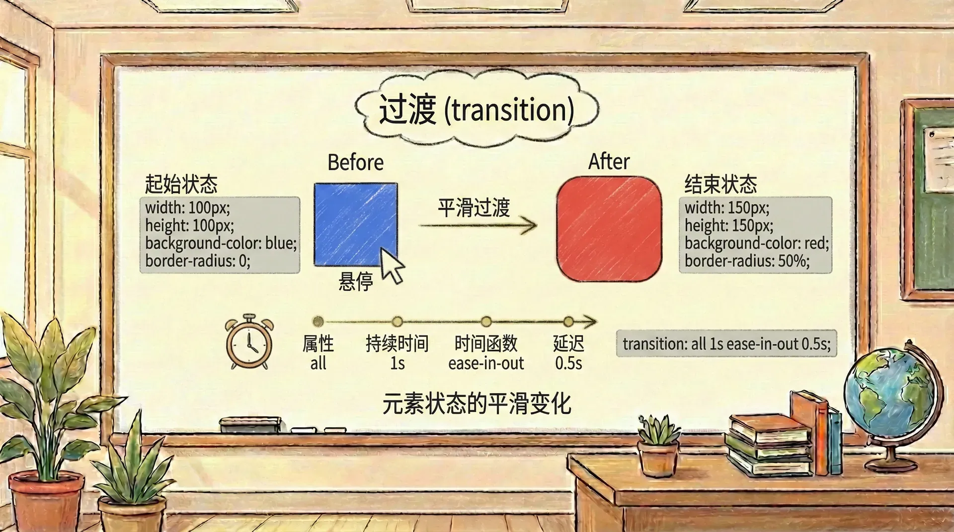
过渡 | 自在学过渡
在网页设计中,我们常常希望元素在状态变化时能够平滑地过渡,而不是突然跳跃。这种平滑的过渡不仅能提升用户体验,还能让界面看起来更加专业和优雅。CSS过渡正是为此而生的,它允许我们控制属性值在一段时间内的变化过程。
其实在前面的学习中,我们已经用了很多次过渡的属性,但是我们没有深入的去讲解他们。因此这里我们专门花点时间看看过渡的属性。

实验室
过渡的基本概念
CSS过渡的核心思想是在元素状态发生变化时,让属性的值能够在指定的时间段内平滑地从一个值过渡到另一个值。通常这种状态变化是由用户的交互行为触发的,比如鼠标悬停、聚焦或者表单状态的变化,但也可以是通过JavaScript动态添加或移除CSS类来实现的。
让我们来看一个简单的例子。假设我们有一个按钮,在默认状态下是红色的,悬停时变成紫色的。如果没有过渡效果,这个颜色变化会瞬间发生,用户可能会感觉有些突兀。但如果我们添加了过渡,颜色就会在200毫秒内逐渐变化,让整个交互过程更加自然流畅。
<!DOCTYPE html>
<html>
<head>
<style>
.transition-button {
background-color: #ff4757;
color: white;
border: none;
padding: 12px 24px;
border-radius: 6px
从上述示例可以发现,当鼠标悬停在按钮上时,按钮的背景色会由红色平滑地转变为紫色,这种色彩变化通过CSS的过渡实现。整个过渡动画持续了200毫秒,并在执行前有50毫秒的停顿。延迟的设计在用户界面中非常有用,比如在下拉菜单展开时添加延迟,有助于给用户反应的缓冲时间,防止因短暂失焦导致菜单立刻收起,提升操作体验。
需要理解的是,不同浏览器对CSS过渡的支持能力可能存在差异。一些早期或不支持CSS3的浏览器虽然同样会响应状态变化,但不会展现平滑过渡动画,仅仅是瞬间切换样式。因此,即便功能层面不受影响,视觉表现仍会因浏览器支持度不同有所差别。
实际开发中,对过渡效果的使用应结合场景谨慎权衡。如果过渡持续时间过长,会让用户觉得界面反应慢,互动变得拖沓;反之,过渡过短,动画变化容易被忽略,失去了过渡的意义。通常建议,将大部分交互元素的过渡时间设置在100毫秒到300毫秒范围内,既有足够的可感知性,也不会拖慢体验。
另外,并非所有UI变化都适合加过渡。例如,链接颜色的变更应当立即生效,使用户能立刻识别当前聚焦对象。再比如在自动补全功能里,新的选项弹出最好立刻显示,而不宜添加淡入淡出的动画,否则可能影响用户的选择效率。
过渡属性
CSS过渡的实现依赖于四个主要属性:transition-property(指定哪些CSS属性参与过渡)、transition-duration(定义动画所需的时间)、transition-timing-function(控制动画速率曲线)、transition-delay(设置延迟时间)。
同时,CSS还提供了一个简写属性transition,可以把这四项内容合并在一行代码里配置。
设定过渡
transition-property用于决定哪些具体的样式属性在变化时启用动画过渡。合理使用该属性,可以让我们灵活选择需要平滑变换的部分,从而达到更细致的交互控制。
<!DOCTYPE html>
<html>
<head>
<style>
.multi-property {
background-color: #3498db;
border: 2px solid #2980b9;
border-radius: 0;
color: white;
padding: 15px
在上面的例子中,我们可以看到当鼠标悬停在元素上时,只有背景色、圆角和缩放变换会平滑过渡,而其他属性如文字大小、内边距等会立即变化。这种选择性的过渡控制让我们能够创造出更加精细的视觉效果。
transition-property的值可以是具体的属性名,也可以是all(表示所有可过渡的属性)或none(表示不应用过渡)。当我们设置了多个属性时,可以为每个属性指定不同的持续时间和时序函数。
设置过渡的持续时间
transition-duration属性控制过渡效果从开始到结束所需要的时间。这个时间通常以毫秒(ms)或秒(s)为单位。
<!DOCTYPE html>
<html>
<head>
<style>
.duration-demo {
display: flex;
gap: 20px;
margin: 20px;
}
.box {
width: 80px;
动画或过渡的持续时间长短会显著影响用户的交互体验。比如,当过渡持续时间较短(如150ms)时,界面响应会显得非常迅捷,能够带给用户流畅利落的感觉;而如果过渡时间较长(如1500ms),则会让用户觉得页面反应变得拖沓、不够灵敏。
过渡节奏的调控方式
transition-timing-function 属性用于设定过渡动画在整个过程中速度如何变化。它不仅内置若干常用的时序函数(如 ease、linear 等),还支持自定义贝塞尔曲线,从而可以实现更多样化、更贴合需求的动画节奏效果。
<!DOCTYPE html>
<html>
<head>
<style>
.timing-demo {
display: flex;
flex-wrap: wrap;
gap: 20px;
margin: 20px;
}
.timing-box {
width
不同的时序函数会让过渡效果产生不同的视觉感受。ease函数会让过渡先慢后快再慢,linear保持匀速,ease-in从慢到快,ease-out从快到慢,而ease-in-out则是先慢后快再慢但变化更平缓。
添加过渡延迟
transition-delay属性可以在过渡开始前设置一个等待时间。这个功能在某些场景下非常有用,比如避免用户意外触发过渡效果。
<!DOCTYPE html>
<html>
<head>
<style>
.delay-demo {
position: relative;
width: 300px;
height: 200px;
background-color: #f8f9fa;
border: 1px solid
在这个下拉菜单的例子中,我们设置了100毫秒的延迟。这意味着当用户将鼠标悬停在父元素上时,子菜单不会立即显示,而是会等待100毫秒。这种延迟可以防止用户在快速移动鼠标时意外触发菜单显示,同时也给用户一个缓冲时间来决定是否真的要查看子菜单内容。
过渡时序函化
下面的图表展示了五种主要的时序函数:ease、linear、ease-in、ease-out和ease-in-out。
从这个图表中,我们可以清楚地看到不同时序函数的特点:
- ease函数(蓝色曲线)是最常用的时序函数,它在开始时缓慢加速,中间快速变化,最后再次减速,形成一个平滑的"S"形曲线
- linear函数(红色直线)保持匀速变化,动画从开始到结束都以相同的速度进行
- ease-in函数(紫色曲线)在开始时缓慢,然后逐渐加速,到结束时达到最大速度
- ease-out函数(橙色曲线)在开始时快速变化,然后逐渐减速,到结束时非常缓慢
- ease-in-out函数(绿色曲线)结合了ease-in和ease-out的特点,开始和结束都比较缓慢,中间相对较快
这些曲线代表了动画进度如何随时间变化的关系。横坐标表示时间的进度(从0到1),纵坐标表示动画的进度(从0到1)。通过观察这些曲线,我们可以直观地理解为什么某些过渡感觉更自然,而另一些则显得生硬或突兀。
高级过渡技巧
使用自定义贝塞尔曲线
除了内置的时序函数(如 ease、linear、ease-in 等),CSS 还允许我们通过 cubic-bezier() 函数自定义过渡的速度曲线。cubic-bezier() 是一种基于三次贝塞尔曲线的时序函数,其语法为 cubic-bezier(x1, y1, x2, y2),其中四个参数分别代表两个控制点的坐标,取值范围通常在 0 到 1 之间。贝塞尔曲线的起点和终点固定为 (0, 0) 和 (1, 1),而通过调整中间两个控制点的坐标,可以灵活地定义动画的加速度、减速度、弹性和回弹等复杂动画节奏。通过合理使用贝塞尔曲线,我们不仅可以模拟常见的内置时序(例如 ease-in-out 等价于 cubic-bezier(0.42, 0, 0.58, 1)),还可以打造如弹跳、回弹、超快启动等高级动画效果,更好地贴合实际的交互需求和视觉设计目标。
<!DOCTYPE html>
<html>
<head>
<style>
.custom-bezier {
width: 100px;
height: 100px;
background-color: #3498db;
border-radius: 8px;
cursor: pointer;
过渡属性的组合使用
在实际开发中,CSS允许我们针对同一个元素的不同属性分别设定过渡时间、时序函数以及延迟等细节参数。
通过为每个需要过渡的属性单独设置 transition-duration、transition-timing-function 和 transition-delay(各参数用逗号分隔,顺序对应 transition-property 指定的属性),我们能够实现多属性、多节奏、多时机的复合动画。
这样做不仅可以让不同的视觉变化拥有各自最合适的表现节奏,还能精确把控每种动画带给用户的观感和反馈,大大提升UI交互的专业度与精细感。
<!DOCTYPE html>
<html>
<head>
<style>
.complex-transition {
width: 150px;
height: 80px;
background-color: #2ecc71;
border-radius: 4px;
color: white;
在上述案例中,我们针对每一个CSS属性分别设定了过渡的持续时间、时序曲线以及延迟时间。通过对这些参数的单独调控,我们能够实现具有层次感的动画过渡,让界面中的不同元素以有序的方式呈现变化,从而增强了视觉体验的丰富性和节奏感。
过渡的简化写法
除了分别设置transition-property、transition-duration、transition-timing-function和transition-delay这四个属性外,更高效的做法是直接使用transition这个简写属性。它允许开发者在一行中同时设置所有有关过渡的参数,使样式书写更加简洁且易于维护。
<!DOCTYPE html>
<html>
<head>
<style>
.shorthand-demo {
display: flex;
flex-direction: column;
gap: 20px;
margin: 20px;
}
.card {
width
从这个例子可以看出,transition简写属性提供了极大的灵活性。上面的卡片使用了两种不同的简写方式:
transition: all 0.3s ease - 让所有可过渡的属性使用相同的设置
transition: background-color 0.2s ease, transform 0.4s cubic-bezier(0.175, 0.885, 0.32, 1.275) 0.1s - 为不同属性设置不同的过渡参数
简写语法的参数顺序
transition属性的参数顺序非常重要:property duration timing-function delay。如果省略某些参数,它们会有默认值:
- 如果省略
property,默认值为all
- 如果省略
timing-function,默认值为ease
- 如果省略
delay,默认值为0s
duration是唯一不能省略的参数
负延迟值的特殊应用
transition-delay属性除了常规的正值以外,还支持负值设置。使用负值时,元素的过渡动画会在触发后立刻启动,但动画效果并不是从头开始,而是直接跳到动画过程的一定进度位置,相当于自动“快进”到过渡的中后段。这种用法可以用来制造提前进行动画的观感,带来与普通延迟不一样的交互体验。
<!DOCTYPE html>
<html>
<head>
<style>
.negative-delay {
width: 120px;
height: 120px;
background-color: #e74c3c;
border-radius: 8px;
cursor: pointer;
在这个例子中,左侧的元素使用了-200ms的负延迟。这意味着当鼠标悬停时,过渡会立即开始,但是会从整个过渡过程的40%处开始(因为200ms是500ms总时长的40%)。结果就是元素看起来像是从中间位置突然开始移动。
右侧的元素使用了正常的正延迟,需要等待200毫秒后才开始过渡。
多个过渡的组合
在CSS中,transition属性允许我们同时为多个不同的属性设置不同的过渡效果。实现这一点时,应将各个过渡效果用逗号隔开分别写在transition属性中。这样,当元素状态变化时,每个属性的过渡会按照各自的持续时间、延迟和缓动函数分别生效,实现更丰富的动态效果。
<!DOCTYPE html>
<html>
<head>
<style>
.multi-transitions {
width: 180px;
height: 100px;
background-color: #9b59b6;
border-radius: 8px;
color: white;
在这个复杂的例子中,我们定义了三个独立的过渡:
background-color 0.2s ease - 背景色在200毫秒内平滑变化
transform 0.6s cubic-bezier(0.175, 0.885, 0.32, 1.275) 0.1s - 变换效果在600毫秒内使用弹性时序函数,延迟100毫秒开始
box-shadow 0.4s ease-in 0.2s - 阴影在400毫秒内淡入,延迟200毫秒开始
这样的设置创造了一种层次感,让不同的视觉变化按照精心设计的节奏依次出现,给用户带来丰富的交互体验。
过渡的中断与反转处理
在实际的用户交互中,过渡经常会被中断。比如用户快速移动鼠标离开一个元素,或者在过渡进行过程中触发了新的状态变化。CSS过渡规范对这种情况有着详细的规定,确保过渡行为的一致性和可预测性。
过渡中断的处理机制
当一个正在进行的过渡被新的属性值变化中断时,浏览器会根据特定的规则来处理这种情况:
<!DOCTYPE html>
<html>
<head>
<style>
.interrupt-demo {
width: 150px;
height: 150px;
background-color: #3498db;
border-radius: 8px;
cursor: pointer;
在这个例子中,我们设置了一个2秒的过渡效果。如果你在过渡进行到一半时快速移开鼠标,元素会从当前状态平滑地返回到初始状态。这种行为是由浏览器自动处理的,让过渡看起来自然流畅。
过渡方向的反转机制
当过渡被中断并开始反向进行时,浏览器会根据中断时已经完成的进度来调整反向过渡的时序。这种机制确保了过渡的连续性和视觉一致性。
<!DOCTYPE html>
<html>
<head>
<style>
.reverse-demo {
width: 200px;
height: 60px;
background-color: #27ae60;
border-radius: 4px;
cursor: pointer;
从这个例子可以看出:
- 上面的元素只有一个变换过渡,当在过渡中途中断时,会用相同的3秒时间返回到初始位置
- 下面的元素有两个过渡:变换用3秒,背景色变化用0.3秒。当中断时,背景色会快速回到初始状态,而变换会用较长的时间
不同时序函数的中断处理
在CSS过渡动画中,不同类型的时序函数(如ease、linear、steps等)在遇到动画中断(如用户在动画尚未完成时移回鼠标)时,其反转与恢复动画的行为存在明显差异。
具体来说,线性(linear)函数在反转时始终以匀速切换动画进度,而ease等缓动函数在反转时会根据当前已完成的进度段对剩余动画时序重新分配,使过渡效果更加平滑,自然。例如,ease 曲线在途中反转时,会表现为重新加速-减速的过程,而不是简单地对原路径反向播放。
类似地,阶梯型函数(steps)在处理中断时,会严格按照分步跳变,不会产生中间态的连续动画。
<!DOCTYPE html>
<html>
<head>
<style>
.timing-comparison {
display: flex;
gap: 20px;
margin: 20px;
}
.timing-box {
width: 80px;
过渡事件监听
CSS Transition 相关事件包括 transitionstart、transitionend 和 transitioncancel,它们分别在过渡动画开始、正常结束与被中断时触发。利用这些事件,我们可以实现如动画同步、用户交互反馈、性能监控等高级功能。
例如,可以在动画开始时禁用按钮避免重复操作,或在动画结束后自动触发后续逻辑。通过监听这些事件,开发者能够专业而细致地掌控动画过程的每一个阶段,从而实现更自然、响应更精确的用户体验。
<!DOCTYPE html>
<html>
<head>
<style>
.event-demo {
width: 120px;
height: 120px;
background-color: #9b59b6;
border-radius: 8px;
cursor: pointer;
这个例子展示了如何监听过渡事件。每次过渡开始、结束或被取消时,都会在日志区域显示相关信息。这对于调试复杂的过渡效果或在过渡完成后执行特定的JavaScript代码非常有用。
通过对过渡中断和反转机制的深入理解,我们可以创建出更加健壮和用户友好的交互效果。
可动画属性和值的插值机制
实际上,并不是所有的CSS属性都能实现过渡动画。只有那些数值之间可以平滑过渡、能够进行连续插值的属性才支持动画效果。属性值的可计算性和插值能力,是判断其能否参与动画的核心依据。
如何判断一个属性是否可动画
评估某个CSS属性是否支持动画,关键在于其不同属性值之间能否存在逻辑上合理的“中间状态”。通常来说,如果两个属性值之间可以找出连续过渡的中间值,这样的属性就具备动画能力。例如,width从100px变为200px,系统可以自动计算出介于两者之间的每一个像素宽度,从而实现平滑动画。然而,有些属性比如display,无论是从block到none,还是反过来,都不存在可插值的中间状态,因此无法应用CSS过渡动画。
<!DOCTYPE html>
<html>
<head>
<style>
.animatable-demo {
display: flex;
flex-wrap: wrap;
gap: 20px;
margin: 20px;
}
.demo-item {
width
上面的例子展示了四种常见的可动画属性:尺寸、颜色、变换和透明度。这些属性都可以进行平滑的插值,因为它们都基于数值或者可以转换为数值的概念。
不同数据类型的插值规则
CSS属性值在进行过渡动画时,其插值机制高度依赖于属性的数据类型。不同类型的属性在计算中间帧、生成动画过渡效果时,遵循各自专属的插值规则。主要类型及其插值细则如下:
- 数值型(Length/Number,单位如px、em、%等):支持线性插值,动画过程中会按照数值大小从起始到结束依次递增或递减。例如
width: 100px → 300px,系统自动插入所有中间宽度。
- 颜色型(Color,如rgb/rgba/hex/hsl/hwb/lab/oklch等):颜色过渡时,浏览器会将起止颜色统一为内部颜色空间(如sRGB或实验性LCH等),对各通道数值分别进行线性插值,形成流畅的颜色渐变效果。例如
background-color: #e74c3c → #3498db。
- 变换型(Transform,如scale/rotate/translate等):各个transform函数的数值参数可插值,动画过程会沿数学曲线平滑过渡。例如
transform: scale(1) → scale(1.2)。
- 透明度型(Opacity):本质为0到1之间的小数,按比例插值,产生平滑的淡入淡出动画效果。
- 阴影/滤镜等复合属性:例如
box-shadow、filter,各数值参数均可插值,浏览器会为每个细分数字成分补齐中间状态。
需要注意的是,若属性属于离散型(如display、visibility、position: absolute|fixed等),则无法插值,浏览器会直接在起止值间切换而无动画。对于复杂类型,浏览器可能需要补全缺失参数后才能安全插值,否则动画表现不可预期。
<!DOCTYPE html>
<html>
<head>
<style>
.interpolation-demo {
display: flex;
flex-direction: column;
gap: 20px;
margin: 20px;
}
.interpolation-item {
padding
复合属性的插值处理
某些CSS属性属于简写属性(shorthand property),它们实际上是对多个相关基础属性的整体封装。例如,border 是 border-width、border-style 和 border-color 的简写,background 可同时设置颜色、图片、重复方式等。
当对简写属性应用过渡动画时,浏览器会将其拆解为对应的单个子属性,并对每一个支持动画的子属性分别执行插值运算。每个子属性在动画过程中都按其自身的插值规则独立过渡,从而实现组合属性的整体平滑变化。需要注意的是,只有那些本身可以插值的子属性才会产生动画效果;而不可插值或离散型的子属性(如 border-style 的不同样式类型)则不会参与动画。
这种机制确保了像 border、margin、padding、background、font 等复合属性在过渡时能表现为多参数协同变化、细腻流畅。例如,对 border 简写属性设置过渡,实际上是对边框的宽度、颜色等多个维度同时插值。
<!DOCTYPE html>
<html>
<head>
<style>
.shorthand-demo {
display: flex;
flex-direction: column;
gap: 20px;
margin: 20px;
}
.shorthand-item {
width
不可动画属性的处理
有些属性由于其值的离散性质,无法进行平滑插值。这些属性在过渡触发时会立即跳跃到新值。例如,display 属性无论是从 block 到 none,还是反过来,都不存在可插值的中间状态,因此无法应用CSS过渡动画。
<!DOCTYPE html>
<html>
<head>
<style>
.non-animatable-demo {
display: flex;
gap: 20px;
margin: 20px;
}
.non-animatable-item {
width: 150px;
理解可动画属性和插值机制是创建高质量CSS过渡的关键。只有深入了解哪些属性可以平滑过渡,哪些属性会立即跳跃,我们才能设计出既美观又实用的过渡效果。
重复值的插值处理
在CSS中,某些属性(比如多重背景、box-shadow 等)可以同时设置多个值。这些情况下,如果要做过渡动画,浏览器会采用一套“值重复与配对”机制,确保动画从头到尾过程流畅自然。
多重值属性的过渡机制
针对类似 background 或 box-shadow 这类具有多个值的属性,浏览器会将起始状态和结束状态中的每一个值配成对。如果两端的值数量不一致,系统会自动把数量少的一侧的最后一个值克隆多次,直到与另一侧数量保持一致。这样可以让每一个值能够平滑地参与插值运算,从而实现整个属性的连贯过渡。
<!DOCTYPE html>
<html>
<head>
<style>
.repeat-interpolation {
width: 250px;
height: 150px;
border-radius: 8px;
cursor: pointer;
transition: all 2
在上述案例里,我们为元素设置了两层背景线性渐变,并分别为每一层指定了不同的尺寸(background-size)与位置(background-position)。在进行过渡动画时,每一组属性(如第一个渐变的尺寸与位置、第二个渐变的尺寸与位置)都会独立地、同步地以动画的形式从初始状态平滑变化到悬停状态所定义的新值。这样就可以观察到背景图案的各项参数(如大小与位置)协同平滑过渡,产生自然流畅的视觉效果。
多值属性插值机制
当 CSS 属性涉及多个值(比如有多个 box-shadow、background-image、background-size 等)时,若起始值和目标值提供的数量不同,浏览器的处理方式是:将值较少的一方的最后一个值重复使用,直到补齐为与较多一方数量一致。这样,每一项都可以一一配对,进而实现每组对应值的逐步插值动画。例如,从三组阴影过渡到两组时,会自动将第二组的终止值复制第三份来对齐,确保整个动画过程的每个细节都得到平滑处理。
<!DOCTYPE html>
<html>
<head>
<style>
.mismatch-values {
width: 300px;
height: 100px;
border-radius: 8px;
cursor: pointer;
transition: all 2
在上面的例子中,初始状态有3个阴影层,而悬停状态只有2个阴影层。浏览器会将较短的列表(2个阴影)重复以匹配较长的列表(3个阴影),然后对每个对应的阴影进行插值。
复杂属性的插值策略
对于像 box-shadow、text-shadow、transform 这类由多个参数或多个组件组成的复杂 CSS 属性,浏览器引擎会将每一个组成部分视为单独的数据类型进行分解,然后分别按照各自的插值规则进行动画计算。
例如,box-shadow 的每条阴影会被独立处理,每条阴影的偏移、模糊半径、扩散半径和颜色,分别按照数值或颜色的插值方式平滑过渡。
transform 也是如此,translate、scale、rotate 等多个变换函数会首先被分解,根据各自的数据类型(如长度、角度、百分比等)分别插值,最后将所有中间结果组合还原为完整的复合属性,实现整体的渐变动画效果。
<!DOCTYPE html>
<html>
<head>
<style>
.complex-interpolation {
width: 250px;
height: 120px;
border-radius: 8px;
cursor: pointer;
transition: all 2
小结
CSS过渡是一项强大的功能,可以让我们在元素状态改变时实现流畅自然的视觉效果,不论是基本属性到复杂时序,还是插值机制与事件驱动,过渡都极大地丰富了现代 Web 界面的交互体验。
只有真正掌握这些核心原理和技巧,我们才能设计出既美观又实用的过渡效果,显著提升 Web 应用的用户体验。在做完下面的一些简单的习题后我们接下来就能学习动画了。
实战练习
练习1:基础过渡设置
创建一个按钮,当鼠标悬停时背景色从红色变为蓝色,过渡时间为0.5秒。请写出完整的CSS代码。
.button {
background-color: red;
transition: background-color 0.5s ease;
}
.button:hover {
background-color: blue;
}
练习2:多属性过渡
创建一个元素,当悬停时同时改变宽度、高度和背景色,宽度从200px变为300px,高度从100px变为150px,背景色从绿色变为紫色,过渡时间为1秒。请写出CSS代码。
.element {
width: 200px;
height: 100px;
background-color: green;
transition: all 1s ease;
}
.element:hover {
width: 300px;
height: 150px;
background-color: purple;
练习3:时序函数选择
观察下面的时序函数,哪一个会让过渡从慢到快?
- A. ease
- B. ease-in
- C. ease-out
- D. linear
B ease-in
ease-in函数让过渡从慢开始,逐渐加速。
练习4:延迟过渡
创建一个按钮,当鼠标悬停时,背景色在0.5秒延迟后开始变化,过渡时间为1秒。请写出CSS代码。
.button {
background-color: #3498db;
transition: background-color 1s ease 0.5s;
}
.button:hover {
background-color: #e74c3c;
}
练习5:自定义贝塞尔曲线
创建一个元素,使用自定义贝塞尔曲线 cubic-bezier(0.68, -0.55, 0.265, 1.55) 进行缩放过渡。请写出CSS代码。
.element {
transform: scale(1);
transition: transform 1s cubic-bezier(0.68, -0.55, 0.265, 1.55);
}
.element:hover {
transform: scale(1.2);
}
练习6:复合过渡
创建一个卡片元素,当悬停时:
- 背景色在0.3秒内变化
- 阴影在0.5秒内变化,延迟0.2秒开始
- 缩放变换在0.8秒内变化,使用弹性时序函数
请写出CSS代码。
.card {
background-color: #3498db;
box-shadow: 0 2px 4px rgba(0,0,0,0.1);
transform: scale(1);
transition:
background-color 0.3s ease,
box-shadow 0.5s ease 0.2s
练习7:可动画属性判断
以下哪些CSS属性可以进行过渡动画?
- A. width
- B. display
- C. color
- D. position
A. width 和 C. color
width是长度值,可以插值;color是颜色值,可以插值。
display和position是离散值,无法进行平滑过渡。
练习8:多重阴影插值
创建一个元素,初始状态有2个阴影,悬停状态有3个阴影。请解释浏览器如何处理这种不匹配的情况。
浏览器会将较短的列表(悬停状态的3个阴影)重复最后一个值来匹配较长的列表(初始状态的2个阴影),然后对每个对应的阴影进行插值。
初始状态:阴影A, 阴影B
悬停状态:阴影X, 阴影Y, 阴影Z
浏览器会将悬停状态扩展为:阴影X, 阴影Y, 阴影Z, 阴影Z
然后分别对 阴影A→阴影X, 阴影B→阴影Y, 阴影B→阴影Z 进行插值。
;
font-size: 16px;
cursor: pointer;
transition: background-color 200ms ease-in 50ms;
}
.transition-button:hover {
background-color: #6c5ce7;
}
</style>
</head>
<body>
<button class="transition-button">悬停查看过渡效果</button>
<p>将鼠标悬停在按钮上,观察背景色的渐变过程</p>
</body>
</html>
30
px
;
font-size: 16px;
transform: scale(1);
width: 200px;
transition-property: background-color, border-radius, transform;
transition-duration: 300ms;
}
.multi-property:hover {
background-color: #e74c3c;
border: 2px solid #c0392b;
border-radius: 20px;
color: white;
padding: 20px 35px;
font-size: 18px;
transform: scale(1.1);
width: 250px;
}
</style>
</head>
<body>
<div class="multi-property">
<p>悬停查看效果</p>
<p>只有背景色、圆角和缩放会平滑过渡</p>
<p>其他属性会瞬间变化</p>
</div>
</body>
</html>
height
:
80
px
;
background-color: #3498db;
border-radius: 8px;
cursor: pointer;
transition: background-color var(--duration);
}
.box:hover {
background-color: #e74c3c;
}
.fast { --duration: 150ms; }
.medium { --duration: 500ms; }
.slow { --duration: 1500ms; }
</style>
</head>
<body>
<div class="duration-demo">
<div class="box fast"></div>
<div class="box medium"></div>
<div class="box slow"></div>
</div>
<p>从左到右:150ms、500ms、1500ms的过渡时间</p>
</body>
</html>
:
100
px
;
height: 60px;
background-color: #9b59b6;
border-radius: 4px;
cursor: pointer;
transition: transform 800ms var(--timing);
}
.timing-box:hover {
transform: translateX(50px);
}
.ease { --timing: ease; }
.linear { --timing: linear; }
.ease-in { --timing: ease-in; }
.ease-out { --timing: ease-out; }
.ease-in-out { --timing: ease-in-out; }
</style>
</head>
<body>
<div class="timing-demo">
<div class="timing-box ease"></div>
<div class="timing-box linear"></div>
<div class="timing-box ease-in"></div>
<div class="timing-box ease-out"></div>
<div class="timing-box ease-in-out"></div>
</div>
<p>从左到右:ease、linear、ease-in、ease-out、ease-in-out</p>
</body>
</html>
#dee2e6
;
margin: 20px;
}
.submenu {
position: absolute;
top: 50px;
left: 20px;
background-color: #ffffff;
border: 1px solid #dee2e6;
border-radius: 4px;
padding: 10px;
opacity: 0;
transform: translateY(-10px);
pointer-events: none;
transition: all 300ms ease-out 100ms;
}
.delay-demo:hover .submenu {
opacity: 1;
transform: translateY(0);
pointer-events: auto;
}
</style>
</head>
<body>
<div class="delay-demo">
<p>将鼠标悬停在这里</p>
<div class="submenu">
<p>子菜单内容</p>
<p>100毫秒延迟后显示</p>
</div>
</div>
</body>
</html>
transition: transform 1s cubic-bezier(0.68, -0.55, 0.265, 1.55);
}
.custom-bezier:hover {
transform: translateY(-20px) rotate(5deg);
}
.bounce-effect {
width: 100px;
height: 100px;
background-color: #e74c3c;
border-radius: 50%;
cursor: pointer;
transition: transform 1s cubic-bezier(0.175, 0.885, 0.32, 1.275);
margin-left: 20px;
}
.bounce-effect:hover {
transform: scale(1.2);
}
</style>
</head>
<body>
<div style="display: flex; gap: 20px; margin: 20px;">
<div class="custom-bezier"></div>
<div class="bounce-effect"></div>
</div>
<p>左侧使用了easeOutBack效果,右侧使用了easeOutBounce效果</p>
</body>
</html>
display: flex;
align-items: center;
justify-content: center;
cursor: pointer;
transition-property: background-color, transform, box-shadow;
transition-duration: 0.3s, 0.6s, 0.4s;
transition-timing-function: ease-out, cubic-bezier(0.175, 0.885, 0.32, 1.275), ease-in;
transition-delay: 0s, 0.1s, 0.2s;
}
.complex-transition:hover {
background-color: #27ae60;
transform: translateY(-5px) scale(1.05);
box-shadow: 0 10px 20px rgba(46, 204, 113, 0.3);
}
</style>
</head>
<body>
<div class="complex-transition">
<span>悬停查看复合过渡</span>
</div>
<p>背景色变化快,缩放变化慢,阴影有延迟出现</p>
</body>
</html>
:
200
px
;
height: 120px;
background-color: #3498db;
border-radius: 8px;
color: white;
display: flex;
align-items: center;
justify-content: center;
cursor: pointer;
font-size: 14px;
text-align: center;
}
.single-transition {
transition: all 0.3s ease;
}
.multi-transition {
transition: background-color 0.2s ease, transform 0.4s cubic-bezier(0.175, 0.885, 0.32, 1.275) 0.1s;
}
.card:hover {
background-color: #2980b9;
transform: translateY(-5px) scale(1.02);
box-shadow: 0 5px 15px rgba(52, 152, 219, 0.3);
}
</style>
</head>
<body>
<div class="shorthand-demo">
<div class="card single-transition">
<span>单一样式过渡:<br/>所有属性一起变化</span>
</div>
<div class="card multi-transition">
<span>多样式过渡:<br/>不同属性不同效果</span>
</div>
</div>
</body>
</html>
transition: transform 500ms ease-out -200ms;
margin: 20px;
}
.negative-delay:hover {
transform: translateX(100px);
}
.normal-delay {
width: 120px;
height: 120px;
background-color: #27ae60;
border-radius: 8px;
cursor: pointer;
transition: transform 500ms ease-out 200ms;
margin: 20px;
}
.normal-delay:hover {
transform: translateX(100px);
}
</style>
</head>
<body>
<div style="display: flex; gap: 20px;">
<div>
<div class="negative-delay"></div>
<p>负延迟:立即开始,跳过前半部分</p>
</div>
<div>
<div class="normal-delay"></div>
<p>正延迟:等待200ms后开始</p>
</div>
</div>
</body>
</html>
display: flex;
align-items: center;
justify-content: center;
cursor: pointer;
transition:
background-color 0.2s ease,
transform 0.6s cubic-bezier(0.175, 0.885, 0.32, 1.275) 0.1s,
box-shadow 0.4s ease-in 0.2s;
margin: 20px;
}
.multi-transitions:hover {
background-color: #8e44ad;
transform: translateY(-8px) rotate(2deg);
box-shadow: 0 8px 25px rgba(155, 89, 182, 0.4);
}
</style>
</head>
<body>
<div class="multi-transitions">
<span>多重过渡效果</span>
</div>
<p>背景色 → 变换 → 阴影,按顺序依次开始</p>
</body>
</html>
transition: all 2s ease-in-out;
margin: 20px;
display: flex;
align-items: center;
justify-content: center;
color: white;
font-size: 14px;
text-align: center;
}
.interrupt-demo:hover {
background-color: #e74c3c;
transform: scale(1.2) rotate(45deg);
border-radius: 50%;
}
</style>
</head>
<body>
<div class="interrupt-demo">
<span>快速悬停和离开<br/>观察过渡中断效果</span>
</div>
<p>快速移动鼠标进出元素,观察过渡如何处理中断</p>
</body>
</html>
transition: transform 3s ease-in-out;
margin: 20px;
}
.reverse-demo:hover {
transform: translateX(150px);
}
.fast-reverse {
width: 200px;
height: 60px;
background-color: #f39c12;
border-radius: 4px;
cursor: pointer;
transition: transform 3s ease-in-out, background-color 0.3s ease;
margin: 20px;
}
.fast-reverse:hover {
transform: translateX(150px);
background-color: #e67e22;
}
</style>
</head>
<body>
<div>
<div class="reverse-demo"></div>
<p>标准反转:用时与前进方向相同</p>
</div>
<div>
<div class="fast-reverse"></div>
<p>快速反转:背景色变化更快</p>
</div>
<p>在过渡中途移开鼠标,观察反转行为的差异</p>
</body>
</html>
height
:
80
px
;
border-radius: 8px;
cursor: pointer;
transition: transform 2s var(--timing);
}
.timing-box:hover {
transform: translateX(120px);
}
.ease-timing { --timing: ease; background-color: #3498db; }
.linear-timing { --timing: linear; background-color: #e74c3c; }
.step-timing { --timing: steps(4, jump-start); background-color: #27ae60; }
</style>
</head>
<body>
<div class="timing-comparison">
<div class="timing-box ease-timing"></div>
<div class="timing-box linear-timing"></div>
<div class="timing-box step-timing"></div>
</div>
<p>ease | linear | steps - 在中途中断观察不同反转效果</p>
</body>
</html>
transition: all 1.5s ease-in-out;
margin: 20px;
display: flex;
align-items: center;
justify-content: center;
color: white;
font-size: 12px;
text-align: center;
}
.event-demo:hover {
background-color: #8e44ad;
transform: scale(1.2);
border-radius: 60px;
}
.event-log {
margin: 20px;
padding: 10px;
background-color: #f8f9fa;
border: 1px solid #dee2e6;
border-radius: 4px;
font-family: monospace;
font-size: 12px;
max-height: 150px;
overflow-y: auto;
}
</style>
</head>
<body>
<div class="event-demo" id="eventElement">
<span>悬停查看事件</span>
</div>
<div class="event-log" id="eventLog"></div>
<script>
const element = document.getElementById('eventElement');
const log = document.getElementById('eventLog');
function logEvent(event) {
const time = new Date().toLocaleTimeString();
const entry = document.createElement('div');
entry.textContent = `[${time}] ${event.type}: ${event.propertyName} (${event.elapsedTime.toFixed(2)}s)`;
log.appendChild(entry);
log.scrollTop = log.scrollHeight;
}
element.addEventListener('transitionstart', logEvent);
element.addEventListener('transitionend', logEvent);
element.addEventListener('transitioncancel', logEvent);
</script>
</body>
</html>
:
120
px
;
height: 80px;
border-radius: 8px;
cursor: pointer;
transition: all 0.5s ease;
display: flex;
align-items: center;
justify-content: center;
color: white;
font-size: 12px;
text-align: center;
font-weight: bold;
}
.width-height {
background-color: #3498db;
width: 120px;
height: 80px;
}
.width-height:hover {
width: 180px;
height: 120px;
}
.color-bg {
background-color: #e74c3c;
}
.color-bg:hover {
background-color: #27ae60;
}
.transform-scale {
background-color: #9b59b6;
transform: scale(1);
}
.transform-scale:hover {
transform: scale(1.2);
}
.opacity-fade {
background-color: #f39c12;
opacity: 1;
}
.opacity-fade:hover {
opacity: 0.3;
}
</style>
</head>
<body>
<div class="animatable-demo">
<div class="demo-item width-height">
<span>尺寸变化<br/>width/height</span>
</div>
<div class="demo-item color-bg">
<span>背景色变化<br/>background-color</span>
</div>
<div class="demo-item transform-scale">
<span>变换效果<br/>transform</span>
</div>
<div class="demo-item opacity-fade">
<span>透明度变化<br/>opacity</span>
</div>
</div>
<p>悬停在每个元素上查看可动画属性的过渡效果</p>
</body>
</html>
:
15
px
;
border-radius: 8px;
cursor: pointer;
transition: all 1s ease;
font-size: 14px;
color: white;
}
.length-interpolation {
background-color: #3498db;
width: 200px;
height: 60px;
font-size: 14px;
line-height: 1.2;
}
.length-interpolation:hover {
width: 300px;
height: 80px;
font-size: 18px;
line-height: 1.5;
}
.color-interpolation {
background-color: rgb(52, 152, 219);
color: rgb(255, 255, 255);
}
.color-interpolation:hover {
background-color: rgb(155, 89, 182);
color: rgb(255, 215, 0);
}
.calc-interpolation {
background-color: #e74c3c;
width: calc(200px + 10%);
height: 60px;
}
.calc-interpolation:hover {
width: calc(300px + 20%);
height: 80px;
}
</style>
</head>
<body>
<div class="interpolation-demo">
<div class="interpolation-item length-interpolation">
长度单位插值:像素、百分比、em等数值单位
</div>
<div class="interpolation-item color-interpolation">
颜色插值:RGB/HSLA颜色空间的平滑过渡
</div>
<div class="interpolation-item calc-interpolation">
计算值插值:calc()函数中的混合单位
</div>
</div>
<p>悬停查看不同数据类型的插值效果</p>
</body>
</html>
:
200
px
;
height: 80px;
cursor: pointer;
transition: all 1s ease;
display: flex;
align-items: center;
justify-content: center;
color: white;
font-size: 14px;
text-align: center;
}
.border-shorthand {
background-color: #27ae60;
border: 2px solid #2ecc71;
border-radius: 0;
}
.border-shorthand:hover {
border: 8px dashed #f39c12;
border-radius: 20px;
}
.padding-shorthand {
background-color: #9b59b6;
padding: 10px;
}
.padding-shorthand:hover {
padding: 30px;
}
.margin-shorthand {
background-color: #e74c3c;
margin: 5px;
}
.margin-shorthand:hover {
margin: 25px;
}
</style>
</head>
<body>
<div class="shorthand-demo">
<div class="shorthand-item border-shorthand">
边框简写属性插值
</div>
<div class="shorthand-item padding-shorthand">
内边距简写属性插值
</div>
<div class="shorthand-item margin-shorthand">
外边距简写属性插值
</div>
</div>
<p>悬停查看简写属性的插值效果</p>
</body>
</html>
height: 100px;
cursor: pointer;
transition: all 1s ease;
display: flex;
flex-direction: column;
align-items: center;
justify-content: center;
color: white;
font-size: 12px;
text-align: center;
padding: 10px;
}
.display-change {
background-color: #3498db;
}
.display-change:hover {
display: inline-block;
width: 200px;
}
.position-change {
background-color: #e74c3c;
position: static;
}
.position-change:hover {
position: relative;
top: 20px;
}
.overflow-change {
background-color: #27ae60;
overflow: visible;
white-space: nowrap;
}
.overflow-change:hover {
overflow: hidden;
}
</style>
</head>
<body>
<div class="non-animatable-demo">
<div class="non-animatable-item display-change">
<span>display属性</span>
<small>立即跳跃</small>
</div>
<div class="non-animatable-item position-change">
<span>position属性</span>
<small>立即跳跃</small>
</div>
<div class="non-animatable-item overflow-change">
<span>overflow属性</span>
<small>立即跳跃</small>
</div>
</div>
<p>这些属性的值会在过渡开始时立即改变,无法平滑过渡</p>
</body>
</html>
s
ease
;
display: flex;
align-items: center;
justify-content: center;
color: white;
font-size: 14px;
text-align: center;
background-image:
linear-gradient(45deg, #3498db, transparent),
linear-gradient(-45deg, #e74c3c, transparent);
background-size: 20px 20px, 30px 30px;
background-position: 0 0, 10px 10px;
}
.repeat-interpolation:hover {
background-size: 40px 40px, 60px 60px;
background-position: 20px 20px, 30px 30px;
}
</style>
</head>
<body>
<div class="repeat-interpolation">
<span>多重背景插值<br/>观察图案的平滑变化</span>
</div>
<p>悬停查看背景图案尺寸和位置的同步变化</p>
</body>
</html>
s
ease
;
display: flex;
align-items: center;
justify-content: center;
color: white;
font-size: 14px;
text-align: center;
background-color: #3498db;
box-shadow:
0 2px 4px rgba(0,0,0,0.1),
0 4px 8px rgba(0,0,0,0.1),
0 8px 16px rgba(0,0,0,0.1);
}
.mismatch-values:hover {
box-shadow:
0 4px 12px rgba(52,152,219,0.3),
0 8px 24px rgba(52,152,219,0.2);
}
</style>
</head>
<body>
<div class="mismatch-values">
<span>不匹配值数量的插值<br/>3个阴影 → 2个阴影</span>
</div>
<p>悬停查看阴影数量变化时的插值效果</p>
</body>
</html>
s
ease
;
display: flex;
align-items: center;
justify-content: center;
color: white;
font-size: 14px;
text-align: center;
background-color: #27ae60;
text-shadow:
1px 1px 2px rgba(0,0,0,0.5),
-1px -1px 1px rgba(255,255,255,0.3);
transform: translate(0, 0) scale(1) rotate(0deg);
}
.complex-interpolation:hover {
text-shadow:
2px 2px 4px rgba(39,174,96,0.8),
-2px -2px 2px rgba(255,255,255,0.5);
transform: translate(10px, 5px) scale(1.1) rotate(5deg);
}
</style>
</head>
<body>
<div class="complex-interpolation">
<span>复杂属性插值<br/>文字阴影和变换</span>
</div>
<p>悬停查看文字阴影和元素变换的复合插值效果</p>
</body>
</html>
}
,
transform 0.8s cubic-bezier(0.175, 0.885, 0.32, 1.275);
}
.card:hover {
background-color: #2980b9;
box-shadow: 0 10px 20px rgba(0,0,0,0.2);
transform: scale(1.05);
}