构建首页 Hero 区域
Hero 区域是网站首页最重要的部分,它是用户访问网站时首先看到的内容。一个优秀的 Hero 区域应该能够立即传达网站的核心价值,吸引用户的注意力,并引导用户采取行动。所以这一节,我们将尝试去构建一个专业的 Hero 区域。
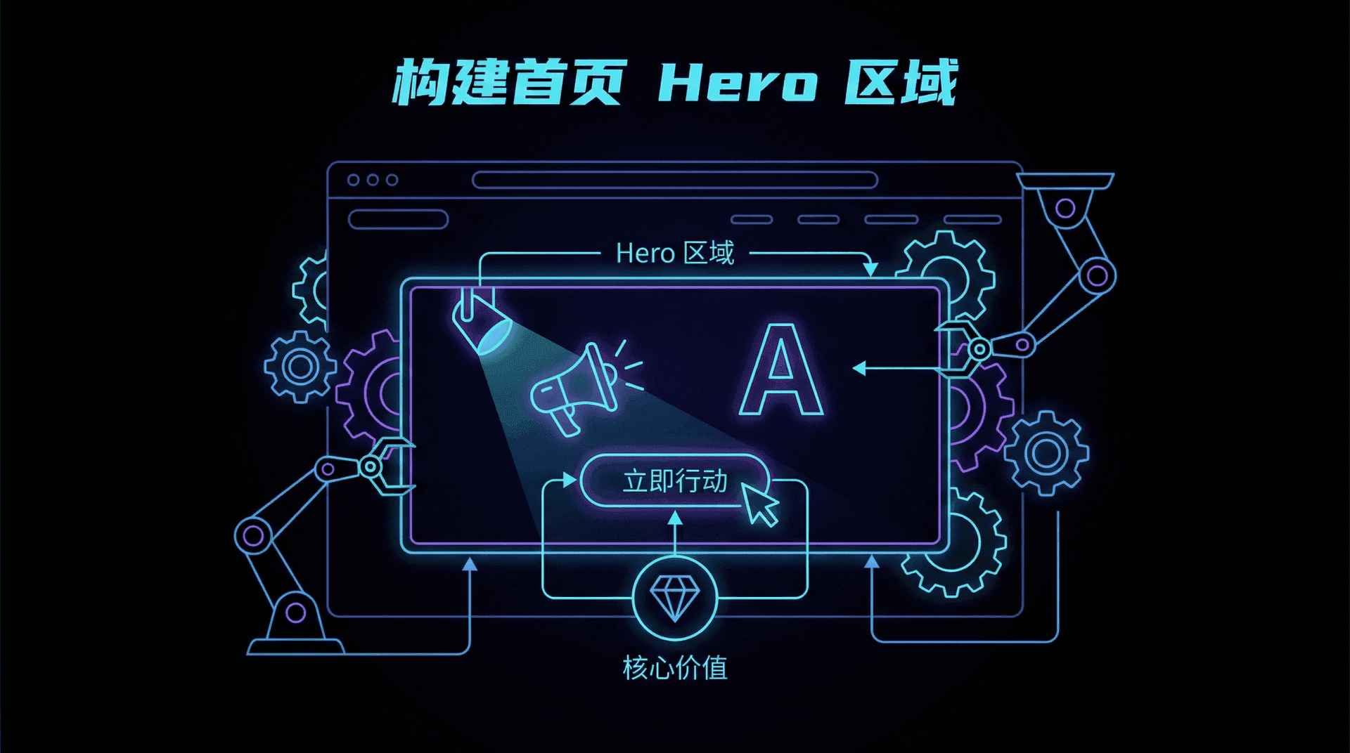
理解 Hero 区域的设计原则
在设计 Hero 区域时,我们需要考虑几个关键要素。首先是视觉层次,最重要的信息应该最突出。其次是行动号召(CTA),应该清晰明确地告诉用户下一步该做什么。最后是视觉吸引力,使用合适的颜色、图片和动画来吸引用户。
让我们一步步来构建这个 Hero 区域。
步骤 1:创建基础结构
首先,我们需要创建一个基本的容器结构。将你的首页文件app/page.tsx更新为以下代码:
export default function Home() {
  return (
    <section className="relative min-h-screen flex items-center bg-linear-to-br from-blue-50 via-indigo-50 to-purple-50 overflow-hidden">
      <div className="container mx-auto px-4 py-12 md:py-20 relative z-10">
        {/* 内容将在这里添加 */}
      </div>
    </section>
  )
}
这里我们创建了一个全屏的 section,使用了渐变背景色,并设置了基本的容器布局。
步骤 2:添加标题和描述
现在让我们添加主要内容区域,包括标题和描述文字:
export default function Home() {
  return (
    <section className="relative min-h-screen flex items-center bg-linear-to-br from-blue-50 via-indigo-50 to-purple-50 overflow-hidden">
      <div className="container mx-auto px-4 py-12 md:py-20 relative z-10">
        <div className="grid md:grid-cols-2 gap-8 md:gap-12 items-center">
          <div className="text-center md:text-left">
            <h1 className="text-4xl sm:text-5xl md:text-6xl font-bold text-gray-900 mb-4 md:mb-6 leading-tight">
注意我们使用了响应式文字大小(text-4xl sm:text-5xl md:text-6xl),并且标题中的"学习之旅"使用了渐变色效果。
步骤 3:添加行动按钮(CTA)
接下来,我们添加两个行动按钮,引导用户采取行动:
import Link from 'next/link'

export default function Home() {
  return (
    <section className="relative min-h-screen flex items-center bg-linear-to-br from-blue-50 via-indigo-50 to-purple-50 overflow-hidden">
      <div className="container mx-auto px-4 py-12 md:py-20 relative z-10">
        <div className="grid md:grid-cols-2 gap-8 md:gap-12 items-center">
          <div className="text-center md:text-left">
            <h1
我们创建了两个按钮:一个是主要按钮(实心蓝色),另一个是次要按钮(白色背景带边框)。按钮在移动端会垂直排列,在桌面端会水平排列。
步骤 4:添加背景装饰
为了让页面更有视觉吸引力,我们添加一些背景装饰元素:
import Link from 'next/link'

export default function Home() {
  return (
    <section className="relative min-h-screen flex items-center bg-linear-to-br from-blue-50 via-indigo-50 to-purple-50 overflow-hidden">
      {/* 背景装饰 */}
      <div className="absolute inset-0">
        <div className="absolute top-0 left-0 w-96 h-96 bg-blue-200/30 rounded-full blur-3xl"></div>
        <div className=
这些模糊的圆形装饰元素为页面增加了深度和视觉层次感。
步骤 5:添加右侧视觉元素
现在让我们在右侧添加一个视觉元素,与左侧的文字内容形成平衡:
import Link from 'next/link'

export default function Home() {
  return (
    <section className="relative min-h-screen flex items-center bg-linear-to-br from-blue-50 via-indigo-50 to-purple-50 overflow-hidden">
      {/* 背景装饰 */}
      <div className="absolute inset-0">
        <div className="absolute top-0 left-0 w-96 h-96 bg-blue-200/30 rounded-full blur-3xl"></div>
        <div className=
这个视觉元素使用了层叠的卡片效果,增加了页面的动态感。
步骤 6:添加统计信息部分
最后,让我们在 Hero 区域下方添加一个统计信息展示区域:
import Link from 'next/link'

export default function Home() {
  return (
    <>
      <section className="relative min-h-screen flex items-center bg-linear-to-br from-blue-50 via-indigo-50 to-purple-50 overflow-hidden">
        {/* ... 之前的 Hero 区域内容 ... */}
      </section>

      {/* 统计信息 */}
      <section className="bg-white py-12 border-t">
        <div className
这个统计信息区域展示了平台的关键数据,增强了用户对平台的信任感。
完整代码汇总
现在,让我们看看完整的代码,我们的app/page.tsx文件应该是这样的,你可以直接复制粘贴这段代码到你的文件中:
import Link from 'next/link'

export default function Home() {
  return (
    <>
      <section className="relative min-h-screen flex items-center bg-linear-to-br from-blue-50 via-indigo-50 to-purple-50 overflow-hidden">
        {/* 背景装饰 */}
        <div className="absolute inset-0">
          <div className="absolute top-0 left-0 w-96 h-96 bg-blue-200/30 rounded-full blur-3xl"></div>
          <div
这个 Hero 区域的设计充分贯彻了现代 Web 设计的核心原则,集成了五大关键要素:
- 吸引人的标题:通过大号字体和视觉重心,将网站的核心价值主张第一时间传递给用户,提升首屏转化率。
- 清晰的描述:用简明有力的副标题,补充说明平台所提供的优势和目标用户,帮助访客迅速建立认知。
- 行动按钮(CTA):配备主次分明的行动按钮,分别引导用户开始学习和深入了解,采用对比鲜明的颜色和合理的间距,提升点击率。
- 视觉装饰元素:利用渐变色块、旋转特效和富有亲和力的图标(如📚)增强视觉吸引力,使页面更加现代且易于辨识,观感突出。
- 统计信息区块:通过真实、具体的数据(如课程数、注册学员数、讲师数)佐证平台实力,提升可信度并激发用户兴趣。
下一步
在这一部分,我们学习了如何构建一个专业的 Hero 区域,包括布局、视觉元素、动画和响应式设计。在下一部分的学习,我们将学习如何创建功能展示区域,向用户展示网站的核心功能。
你已经掌握了 Hero 区域的构建方法!现在你可以创建吸引人的首屏体验,有效传达网站价值并引导用户行动。这些技能未来将帮助你提升网站的转化率。
开启你的
<span className="bg-linear-to-r from-blue-600 to-purple-600 text-transparent bg-clip-text">
学习之旅
</span>
</h1>
<p className="text-lg md:text-xl text-gray-600 mb-6 md:mb-8 leading-relaxed">
为每个人提供免费、高质量的教育资源。无论你的背景如何,都可以在这里找到适合的学习内容,开启知识的大门。
</p>
</div>
</div>
</div>
</section>
)
}
className
=
"text-4xl sm:text-5xl md:text-6xl font-bold text-gray-900 mb-4 md:mb-6 leading-tight"
>
开启你的
<span className="bg-linear-to-r from-blue-600 to-purple-600 text-transparent bg-clip-text">
学习之旅
</span>
</h1>
<p className="text-lg md:text-xl text-gray-600 mb-6 md:mb-8 leading-relaxed">
为每个人提供免费、高质量的教育资源。无论你的背景如何,都可以在这里找到适合的学习内容,开启知识的大门。
</p>
<div className="flex flex-col sm:flex-row gap-4 justify-center md:justify-start">
<Link
href="/courses"
className="bg-blue-500 text-white px-6 md:px-8 py-3 rounded-lg font-semibold hover:bg-blue-600 transition-colors text-center"
>
开始学习
</Link>
<Link
href="/about"
className="bg-white text-blue-500 border-2 border-blue-500 px-6 md:px-8 py-3 rounded-lg font-semibold hover:bg-blue-50 transition-colors text-center"
>
了解更多
</Link>
</div>
</div>
</div>
</div>
</section>
)
}
"absolute bottom-0 right-0 w-96 h-96 bg-purple-200/30 rounded-full blur-3xl"
></
div
>
</div>
<div className="container mx-auto px-4 py-12 md:py-20 relative z-10">
{/* ... 之前的内容 ... */}
</div>
</section>
)
}
"absolute bottom-0 right-0 w-96 h-96 bg-purple-200/30 rounded-full blur-3xl"
></
div
>
</div>
<div className="container mx-auto px-4 py-12 md:py-20 relative z-10">
<div className="grid md:grid-cols-2 gap-8 md:gap-12 items-center">
<div className="text-center md:text-left">
{/* ... 之前的标题、描述和按钮 ... */}
</div>
<div className="relative h-64 md:h-96">
<div className="absolute inset-0 bg-linear-to-br from-blue-400 to-purple-500 rounded-2xl shadow-2xl transform rotate-3 opacity-20"></div>
<div className="absolute inset-0 bg-linear-to-br from-purple-400 to-pink-500 rounded-2xl shadow-2xl transform -rotate-3 opacity-20"></div>
<div className="absolute inset-0 bg-white rounded-2xl shadow-xl flex items-center justify-center p-8">
<div className="text-center">
<div className="text-6xl md:text-8xl mb-4">📚</div>
<p className="text-gray-600 font-semibold text-lg md:text-xl">免费教育资源平台</p>
</div>
</div>
</div>
</div>
</div>
</section>
)
}
=
"container mx-auto px-4"
>
<div className="grid grid-cols-1 md:grid-cols-3 gap-8 text-center">
<div className="p-6">
<div className="text-4xl md:text-5xl font-bold text-blue-600 mb-2">1000+</div>
<div className="text-gray-600 text-lg">免费课程</div>
</div>
<div className="p-6">
<div className="text-4xl md:text-5xl font-bold text-purple-600 mb-2">50K+</div>
<div className="text-gray-600 text-lg">注册学员</div>
</div>
<div className="p-6">
<div className="text-4xl md:text-5xl font-bold text-pink-600 mb-2">200+</div>
<div className="text-gray-600 text-lg">专业讲师</div>
</div>
</div>
</div>
</section>
</>
)
}
className
=
"absolute bottom-0 right-0 w-96 h-96 bg-purple-200/30 rounded-full blur-3xl"
></
div
>
</div>
<div className="container mx-auto px-4 py-12 md:py-20 relative z-10">
<div className="grid md:grid-cols-2 gap-8 md:gap-12 items-center">
<div className="text-center md:text-left">
<h1 className="text-4xl sm:text-5xl md:text-6xl font-bold text-gray-900 mb-4 md:mb-6 leading-tight">
开启你的
<span className="bg-linear-to-r from-blue-600 to-purple-600 text-transparent bg-clip-text">
学习之旅
</span>
</h1>
<p className="text-lg md:text-xl text-gray-600 mb-6 md:mb-8 leading-relaxed">
为每个人提供免费、高质量的教育资源。无论你的背景如何,都可以在这里找到适合的学习内容,开启知识的大门。
</p>
<div className="flex flex-col sm:flex-row gap-4 justify-center md:justify-start">
<Link
href="/courses"
className="bg-blue-500 text-white px-6 md:px-8 py-3 rounded-lg font-semibold hover:bg-blue-600 transition-colors text-center"
>
开始学习
</Link>
<Link
href="/about"
className="bg-white text-blue-500 border-2 border-blue-500 px-6 md:px-8 py-3 rounded-lg font-semibold hover:bg-blue-50 transition-colors text-center"
>
了解更多
</Link>
</div>
</div>
<div className="relative h-64 md:h-96">
<div className="absolute inset-0 bg-linear-to-br from-blue-400 to-purple-500 rounded-2xl shadow-2xl transform rotate-3 opacity-20"></div>
<div className="absolute inset-0 bg-linear-to-br from-purple-400 to-pink-500 rounded-2xl shadow-2xl transform -rotate-3 opacity-20"></div>
<div className="absolute inset-0 bg-white rounded-2xl shadow-xl flex items-center justify-center p-8">
<div className="text-center">
<div className="text-6xl md:text-8xl mb-4">📚</div>
<p className="text-gray-600 font-semibold text-lg md:text-xl">免费教育资源平台</p>
</div>
</div>
</div>
</div>
</div>
</section>
{/* 统计信息 */}
<section className="bg-white py-12 border-t">
<div className="container mx-auto px-4">
<div className="grid grid-cols-1 md:grid-cols-3 gap-8 text-center">
<div className="p-6">
<div className="text-4xl md:text-5xl font-bold text-blue-600 mb-2">1000+</div>
<div className="text-gray-600 text-lg">免费课程</div>
</div>
<div className="p-6">
<div className="text-4xl md:text-5xl font-bold text-purple-600 mb-2">50K+</div>
<div className="text-gray-600 text-lg">注册学员</div>
</div>
<div className="p-6">
<div className="text-4xl md:text-5xl font-bold text-pink-600 mb-2">200+</div>
<div className="text-gray-600 text-lg">专业讲师</div>
</div>
</div>
</div>
</section>
</>
)
}
构建首页 Hero 区域 | 自在学